Best Practices For Conversion Rate Optimization – Part 6 of 6

This is the sixth & last article in the series of 6 articles focusing on the Best Practices for Conversion Rate Optimization.

Before we dive deeper into the Best practices for CRO, I would like to mention that the following content is based upon the learnings that I did during the seventh week of Conversion Optimization, my nano degree course at CXL Institute, led by Peep Laja & team.

I have divided this article into six parts to ensure maximum readability & thorough understanding.

In the last article, we discussed

  • Visual Hierarchy
  • FAQs on Website
  • Importance of Visual Design

In this article, we will discuss,

  • Internal Search
  • Shopping cart pages
  • Ecommerce checkout pages

Let’s get started.

Internal Search

It’s a well-known fact that people who perform searches on an e-commerce website, tend to convert better. If you are having more 20 products or pages, it would be highly beneficial to add the search functionality.

Most of the time, people browse first as they don’t know what exactly they want. So they search with keywords, ending up on the particular product page if they find it. Let’s go through some of the best practices for the conversion rate optimization focusing on the internal searches.

Make The Search Box Bigger

Have you noticed how Amazon encourages search? They have added a search bar right at the top, with a dropdown menu for category selection just in case the visitor wants to refine its search.

Apart from size, the location of the search bar also matters. Most of the time visitors have to look around for the search bar, which highly affects the conversion rate.

Best Practices for Conversion Rate Optimization by Jibran Yousuf

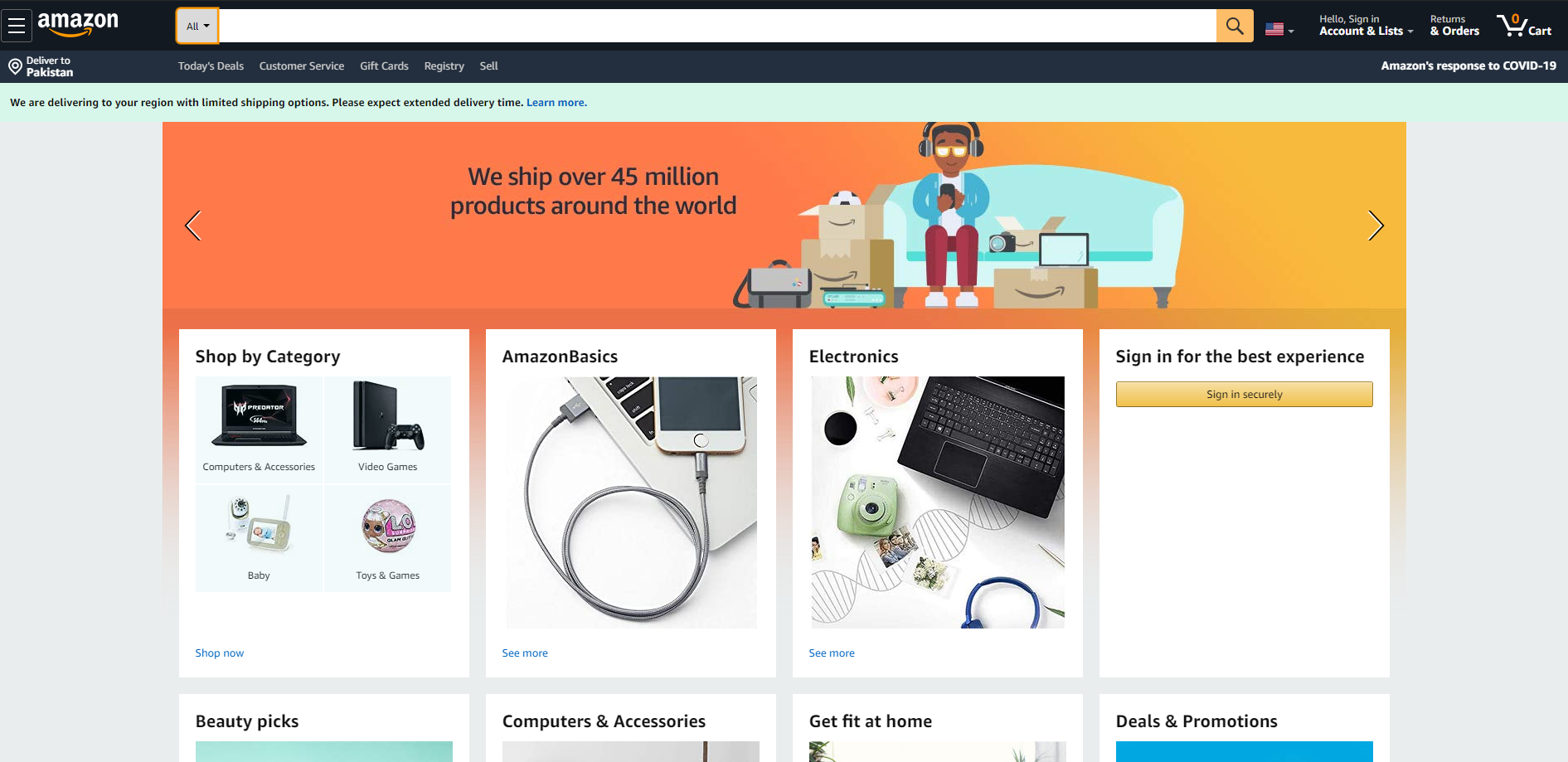
Image Courtesy: Amazon.com

Product Images In The Site Search Window Boost Conversions

The search bar has evolved a lot in the past few years. Some stores show results on their search results pages, however, a widely adopted best practices is to show search results right under the search bar when the query is being typed.

Take a look at this t-shirt store, I searched for “Dragon” and instantly got results below the search bar, handy, isn’t it?

Best Practices for Conversion Rate Optimization by Jibran Yousuf

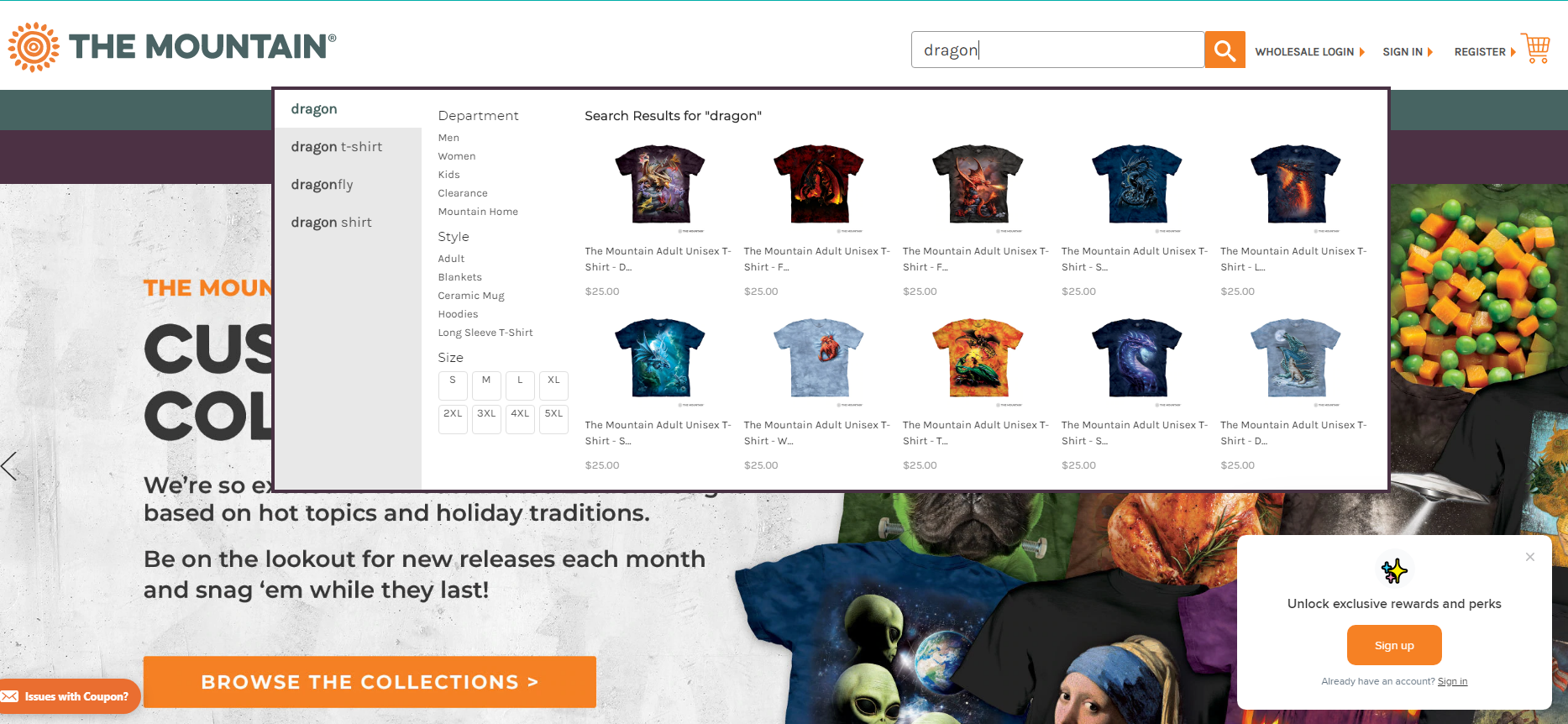
Image Courtesy: The Mountain

Optimize The Search Function

How can you make your search functionality better? Take care of these 3 basic add-ons.

  1. Enable autocomplete – visitors should get suggestions as they type.
  2. Show results even if the search query had typos.
  3. Avoid “No Results found” – show relevant results if there are no exact results.

Shopping Cart Pages

Shopping cart is one of the most critical pages for your website. As soon as a buyer adds their first item in the cart, they have progressed to shopping from browsing. Our job is to make sure they progress towards payment.

What Should A Cart Addition Look Like?

Every time an item is added to the cart, a confirmation must be shown to the buyer. It can be either a small popup on the right side, it can be a tiny toast or a simple animation. You can also show the cart on the right-hand side of the page as soon as they add their first product. This way they will be able to see the cart contents along with the total until the moment.

Best Practices for Conversion Rate Optimization by Jibran Yousuf

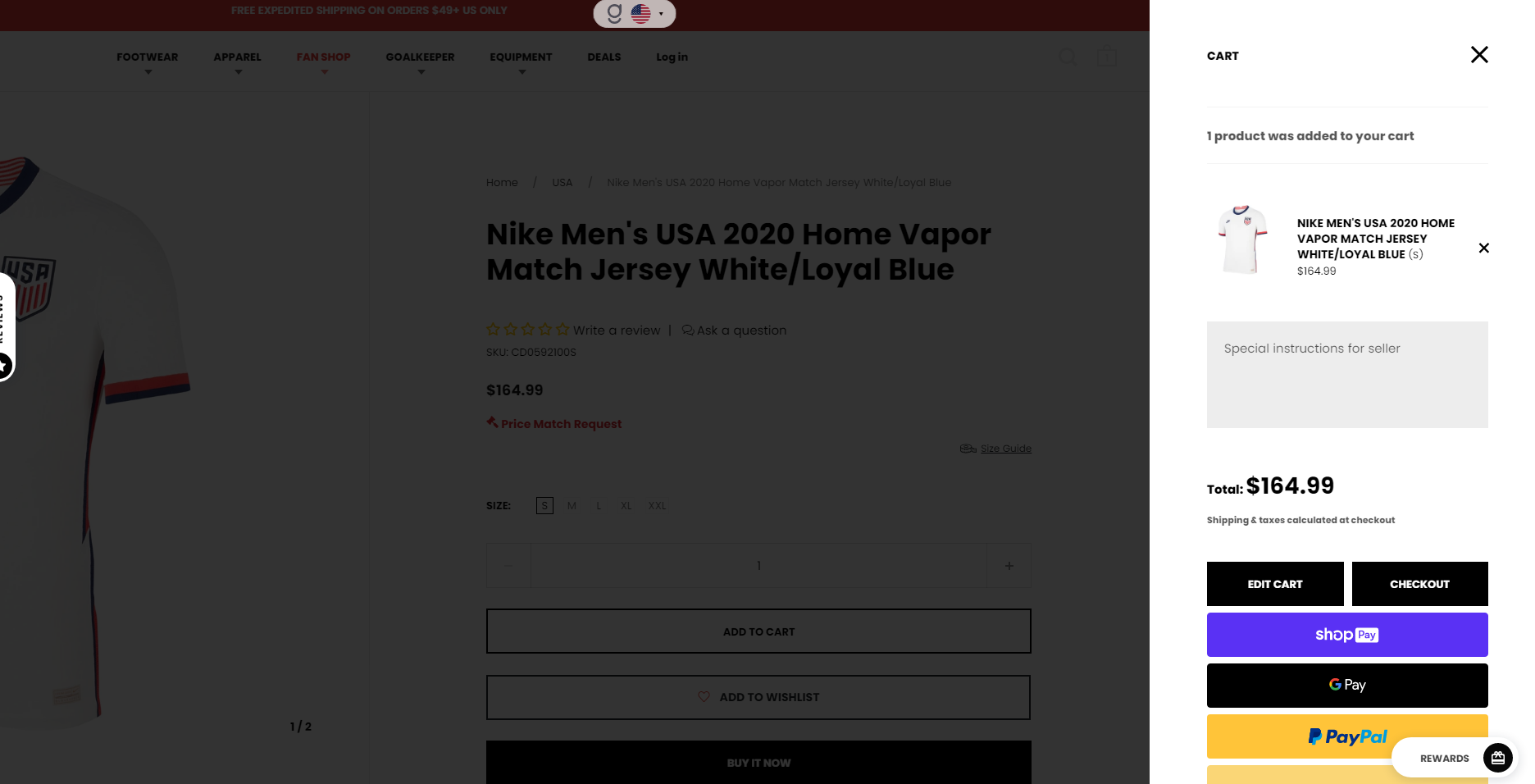
Image Courtesy: aztecasoccer.com

The Product Is In The Cart, Now What?

As we talk about the cart addition, what’s the suggested action now? Here are the two widely used approaches.

  1. Show ‘cart add’ confirmation and remain on the same page.
  2. Transfer the user onto the cart page.

Both of the above-mentioned approaches have their own pros & cons, as it depends on the strategy for your industry. The metrics to keep in mind are:

  • Average transaction value
  • Average quantity per transaction

Displaying Cart Contents Well

How should your cart look like? Follow this checklist:

  • Product photos
  • Product name & price
  • Ability to remove, save for later, change details like size
  • Show the kind of payments they accept
  • Show total price with the option to change the shipping
  • A clear call to action
Best Practices for Conversion Rate Optimization by Jibran Yousuf

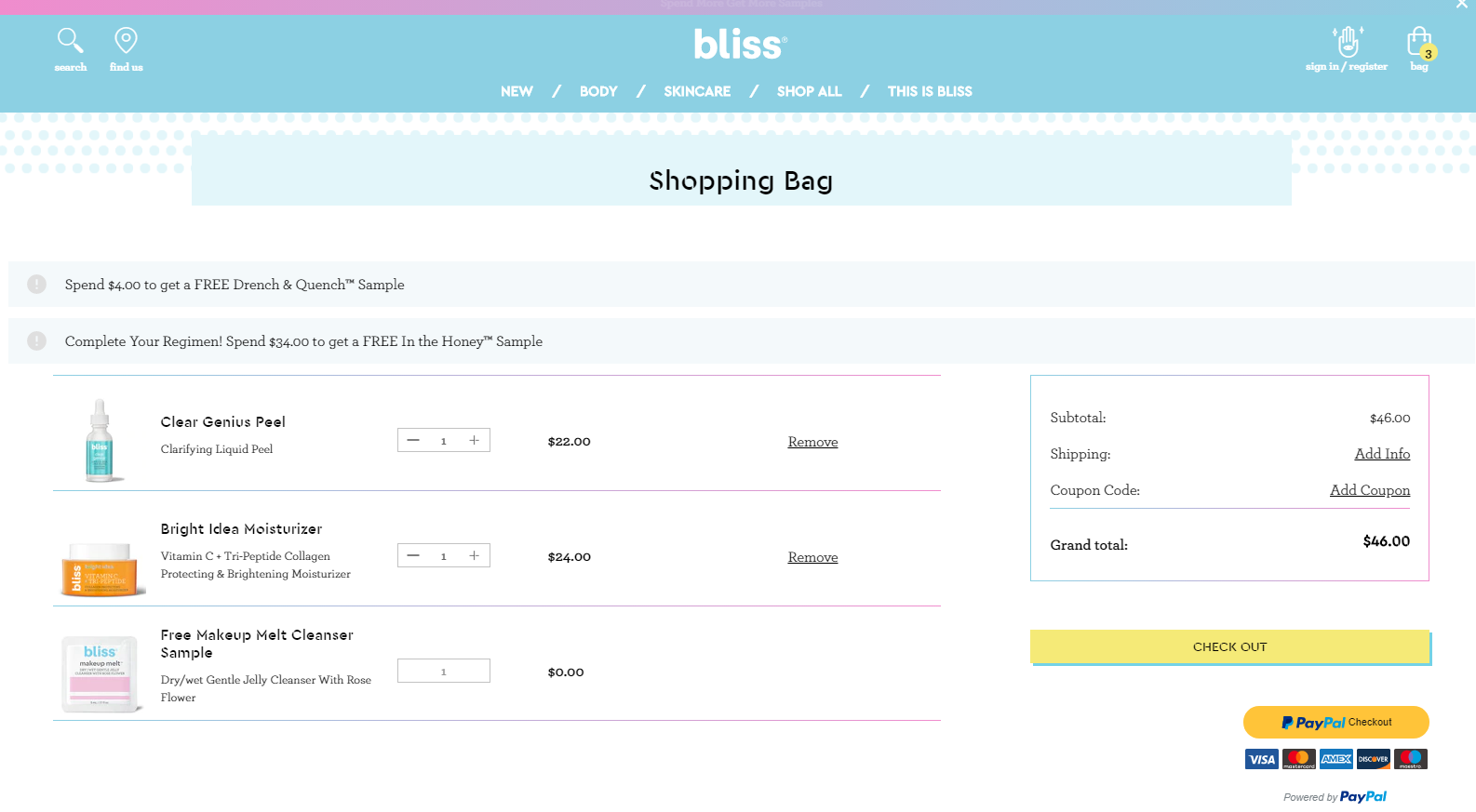
Image Courtesy: blissworld.com

Get The Visual Hierarchy Right

What is the most desired action on a shopping cart page? The “Continue To Checkout”button. If you have a website where people tend to buy a few products per order, make sure you show them two CTAs, one above & below the cart.

Tip: This is a good time to address the FUDs (Fears, Uncertainties & Doubts), so include a few icons to indicate secure transactions. Also, show all the possible payment options as it has proven to have a positive effect on conversions.

Don’t Make Coupons Prominent

Have you ever visited the cart page, and realized you don’t have a coupon code? It hurts, right? You feel less special triggering the thought of buying something expensive than others.

Buyers might leave the website to search for coupons on Google and might result in card abandonment.

How to avoid this?

Offer a “Got a coupon?” link or something similar, and clicking on the link makes an input field. Text links are not visually very prominent, so fewer people will pay attention to them.

People who already have a coupon code will be looking for it – so unless you hid it really well, they will find it and will be able to apply their coupon code.

Remind Them About Shipping And Security

As we discussed in the last article about FAQs that all the questions must be addressed in the copy. Likewise, mention the mode of shipment, return policy, secure payment & related concerns on the page.

Persistent Cart

Persistent Cart not only improves the customer experience by combining guest and customer carts and allowing customers to start or finish check out from multiple devices, but it also increases conversion rates by reducing cart abandonment.

Save all the items in shopping the cart when a customer logs in. When they log out or access the cart from a different PC, re-add those (previous) items into their cart.

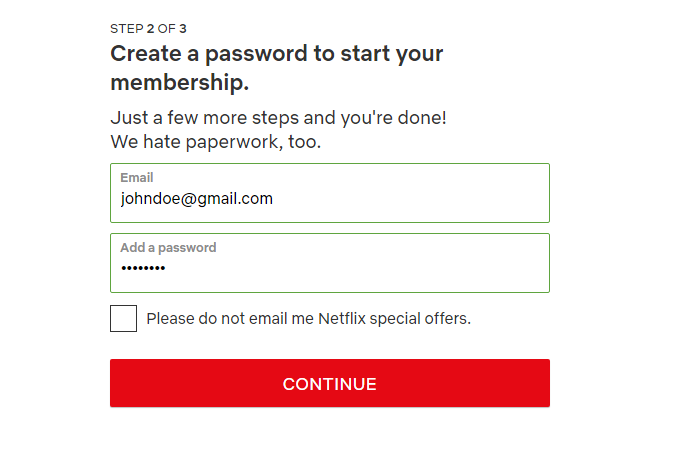
Ecommerce Checkout Pages

Follow these simple tips to ensure maximum conversions:

  1. Leave credit card info for last
  2. Design a payment form that looks like an actual credit card
  3. Make it look secure
  4. Store credit cards in your system

So, are you ready to implement some of the above best practices for the conversion rate optimization that we discussed?

P.S: If you found this post helpful, please share it on social media.

RECEIVE WEEKLY LESSONS

    Best Practices For Conversion Rate Optimization – Part 5 of 6

    This is the fifth article in the series of 6 articles focusing on the Best Practices for Conversion Rate Optimization.

    Before we dive deeper into the Best practices for CRO, I would like to mention that the following content is based upon the learnings that I did during the Second Week of Conversion Optimization, my nano degree course at CXL Institute, led by Peep Laja & team.

    I have divided this article into six parts to ensure maximum readability & thorough understanding.

    In the last article, we discussed

    • Home pages
    • Pricing & pricing pages
    • Website speed optimization

    In this article, we will discuss,

    • Visual Hierarchy
    • FAQs on Website
    • Importance of Visual Design

    Let’s get started.

    Visual Hierarchy

    A hierarchy is an organizational structure in which items are ranked according to levels of importance.

    When we talk about visual hierarchy, we focus on the order in which the human eye perceives the design.

    In web design, there are some sections or parts that are more important than others. These can be forms, having certain CTAs, value propositions. Since these are important, you would want them to get more attention and time.

    Remember, that visual hierarchy is not only about size, but also about color, & position of an element on the website.

    If you are having 5 identical buttons on your website, the user won’t be able to differentiate and you will always get random clicks. However, if you make a button prominent by changing its color, size, or position, you will be driving more clicks on that particular button.

    Start With The Business Objective

    The easiest way to prioritize elements is to rank them on the basis of your business objective.

    In order to understand this phenomenon and practice it, start visiting the website and rank them the elements in the visual hierarchy. Compare them with your own website. Do changes as per your analysis.

    Rank Your Most Wanted Actions For Every Page

    Once you are done with the landing page, head over to other pages. Identify the most wanted action on each of these pages. Make it stand out on the whole page.

    Example: ActiveCampaign wants the visitor to choose the Professional Plan, there can be several reasons for that. So they made it prominent by putting a badge of Most Popular and highlighting the plan with dark blue color.

    Best Practices for Conversion Rate Optimization by Jibran Yousuf

    Image Courtesy: ActiveCampaign

    FAQs On Websites

    Frequently Asked Questions (FAQs) is a list of answers to common questions about a product or service.

    The purpose of FAQs is to provide information on frequent questions or concerns.

    The question is, should a website has an FAQ section or not?

    For a marketer, the priority should be to eliminate the need for FAQs. If your audience has to read instructions to figure your product or service, you are not communicating the message correctly.

    There are many websites that put their whole pitches in FAQs disguised as questions, which is an absolute waste of space.

    If you are needing an FAQ section to explain your pricing, you must review your pricing page and the whole copy. Try to put the answers to FAQs in the copy.

    How to figure what to put in the copy? Just pay attention to the questions that are being asked via support emails, live chat & queries. Then put the answers to these questions into your website copy.

    Importance Of Visual Design

    What is your definition of the best design?

    The best design is the one that was driven by data and brings in the most money. Creativity is important, and an essential part of web designing but the decision should be taken on the basis of data.

    Why design is important? Humans process visuals 50 times faster than copy, and we are quick to judge. Period.

    Design affects the trust scale too. If you a poorly design website, visitors would instantly doubt your authenticity within milliseconds.

    Let’s talk about a few critical, & objective aspects of design.

    People Judge Websites In Less Than 50 Milliseconds

    Humans make snap judgments when they meet a new person; websites are judged similarly!

    As per the research conducted by Gitte Lindgaard, Gary Fernandes, Cathy Dudek & J. Brown. It was concluded that it takes about 50 milliseconds for visitors to form an opinion about your website.

    As per the research conducted by Google, visitors develop opinions even within 17 ms (though the effect was less pronounced on some design factors).

    The first impression depends on multiple factors, some of them are:

    • Structure
    • Color
    • Spacing
    • Symmetry
    • Amount of Text
    • Fonts

    First Impressions Are 94% Design-related

    As stated earlier, the design drives trust.

    There have been multiple studies, that concluded that design elements have the biggest influences on first impressions, including logo, main images, colors & the navigation menu.

    Human minds process visuals 50 times faster than the copy.

    Inspiration Drives Better First Impressions

    Impression-related impressions have a greater impact on the first-impression formation, followed by usability. Visual appealing stimuli are an important tool for getting visitors to stay on your website.

    If you are a tour operating website, using larger than life photography would really increase the gains.

    Have a look at the Active Adventures website, as they know how to capture people when they feel most inspired.

    Best Practices for Conversion Rate Optimization by Jibran Yousuf

    Two Key Ingredients Of Web Design People Like: Simplicity And Prototypicality

    Simplicity: As per a study by Google, in 2012, researchers found that simpler & familiar design is better, as compared to visually complex websites.

    The simpler design promotes less noise, which means fewer distractions. Simplicity is about focus & clarity of the purpose that should make the visitors instantly understand what’s going on, leading to the singular goal of the page.

    Prototypicality: The human mind creates a template of everything that it interacts with. When we put the same phenomenon on websites, the human mind creates a blueprint of how a SaaS website, blog, or e-commerce site should look like.

    If you change the design too much in the pursuit of innovation, it might backfire.

    Stop Arguing Over Opinions. Data-driven Design Is The Way: Measurable Approach To Better Design

    If it can be measured, it can be improved.

    There are several tools that let you assess your design, measure the clicks, and analyze the funnel. How long they stay, and what errors & issues make them leave the website.

    The whole point of data-driven design is to use the data to identify what’s working and what’s not, and to improve productivity.

    So, are you ready to implement some of the above best practices for the conversion rate optimization that we discussed?

    P.S: If you found this post helpful, please share it on social media.

    RECEIVE WEEKLY LESSONS

      Best Practices For Conversion Rate Optimization – Part 4 of 6

      This is the fourth article in the series of 6 articles focusing on the Best Practices for Conversion Rate Optimization.

      Before we dive deeper into the Best practices for CRO, I would like to mention that the following content is based upon the learnings that I did during the Second Week of Conversion Optimization, my nano degree course at CXL Institute, led by Peep Laja & team.

      I have divided this article into six parts to ensure maximum readability & thorough understanding.

      In the last article, we discussed

      • Principles of persuasive design
      • Typography and content
      • Radical redesign vs. evolutionary design

      In this article, we will discuss,

      • Home pages
      • Pricing & pricing pages
      • Website speed optimization

      Let’s get started.

      Home Pages

      Whenever a home page is designed, there are two goals as the main objectives.

      1. Provide information to the user/visitor
      2. Provide useful links via top-level navigation for all the related additional information

      As we dive deeper into the home page design, we come across the third goal or you can term it as the secondary goal. The secondary goal is to send visitors to the sales funnel. In order to achieve this, you have to work on the page fold, CTAs and visuals to lead the visitor in a particular direction.

      To assess a home page, we look for answers to the following questions

      1. Does the page have a clear value proposition?
      2. Is there a single, clear primary call to action?
      3. Are there links to additional information?

      Have a look at the home page of Slack and analyze it as per the above questions.

      Best Practices for Conversion Rate Optimization by Jibran Yousuf

      Courtesy: Slack.com

      CXL conducted a study to evaluate the value proposition presentation and came around some interesting insights.

      • The value proposition should be bigger intriguing the participants to notice it and focus on it.
      • Bullet lists are preferred over a short paragraph.
      • If you increase the benefits, it is easier for the visitor to recall a significant number of them.

      However, it’s not recommended to blindly copy a home page, assuming it would yield similar results for your website as well. So keep experimenting by trying out different copies, visuals & layouts.

      Pricing & Pricing Pages

      The pricing page is the goal line to the business objective; It’s the point at which a buying decision is made.

      We, as a business owner put so much time, sweat equity, and love into our products, but when the time comes to set up our pricing and build out our pricing page we spend only around a few hours arguing amongst our teams before deciding the number backed by a few discussions. As we talk about the best practices for conversion rate optimization, pricing page plays an important role in determining the growth of your business.

      The Higher The Price Point, The More You Need To Explain

      How much time would you spend on taking the decision if the product price is 1$? Minutes or even seconds. But if the product is being sold for 1000$, now? You would want to know more information or consult the product representative, take a look at reviews, or even read the FAQs.  In other words, the more expensive your product or service is, the more content needs to be in front to back your pricing.

      Don’t Ask People How Much They Would Pay

      Instead of asking people to suggest the pricing, create a simple formula around it. Test the pricing with actual traffic and experiment with a few numbers until you come up with a rational price that performs well.

      Things That Typically Work Well And You Should Experiment With

      • Multiple prices vs. one price – list multiple packages with proper differences so they can decide which one is the best for them.
      • Decoy pricing – a tricky scenario where one package is given an upper hand to ease the buyer’s decision
      • Price Anchoring/Contrast principle – create multiple packages, having a huge difference, causing the customer to buy the cheaper pricing package/plan.
      • Decoy + Contrast – use the above two points to create a pricing strategy for different packages.
      • Price ending with 9s – do you think $9 price ending increases demands? Yes, and it’s backed by a number of case studies.

      Should You Always Reveal The Prices (even in B2B)?

      Definitely, if your competitors are disclosing the pricing on their website, whereas you are offering the visitor to request a quote, you will lose a lot of business. Most of the time, visitors are too impatient to request a quote.

      However, if you don’t have fixed prices, you can always put a few slabs for the visitors so they would have an idea of estimated pricing. This practice will also ensure better qualified leads.

      Best Practices for Conversion Rate Optimization by Jibran Yousuf

      Image Courtesy: Logz.io

      Some Best Practices/tips For Optimizers To Consider When Assessing Pricing Design

      1. Make it easy for the visitor to understand the differences between plans.
      2. Help the people identify the right plan for themselves.
      3. Address FUDs (fears, uncertainties, doubts).
      4. Offer multiple currency options to aid their buying decision
      5. Give a discount on annual plans
      6. Display a clear call to action

      Website Speed Optimization

      Website speed optimization affects the instantaneous gratification of the visitor. You wouldn’t want your website to take extra time to load as the visitor would instantly shift the focus on any other tab on the browser. A fast loading website can have positive effects on everything from user experience to bounce rate, time on site, and other important metrics.

      Ideal Site Speed

      Jakob Nielsen, who holds a Ph.D. in human-computer interaction, says 10 seconds can be the maximum loading time for a website.

      Let’s take a look at some interesting stats:

      Image Courtesy: Google PageSpeed Insights & Nonfig

      Tools To Evaluate Site Speed

      All of these tools make it simple to test your site’s performance – usually, it’s as easy as pasting in your site’s URL and letting the tool work its magic.

      Best Practices for Conversion Rate Optimization by Jibran Yousuf

      Tip: Check speed info in Google Analytics by visiting speed reports under the Behavior.

      Best Practices for Conversion Rate Optimization by Jibran Yousuf

      So, are you ready to implement some of the above best practices for the conversion rate optimization that we discussed?

      P.S: If you found this post helpful, please share it on social media.

      RECEIVE WEEKLY LESSONS

        Best Practices For Conversion Rate Optimization – Part 3 of 6

        This is the second article in the series of 6 articles focusing on the Best Practices for Conversion Rate Optimization. You can read the second part here.

        Before we dive deeper into the Best practices for CRO, I would like to mention that the following content is based upon the learnings that I did during the Second Week of Conversion Optimization, my nano degree course at CXL Institute, led by Peep Laja & team.

        I have divided this article into six parts to ensure maximum readability & thorough understanding.

        In the last article, we discussed

        • E-commerce Category Pages
        • E-commerce Signups
        • Incoming Phone Leads & Call Tracking.

        In this article, we will discuss,

        • Principles of persuasive design
        • Typography and content
        • Radical redesign vs. evolutionary design

        Let’s get started.

        Principles Of Persuasive Design

        The literal definition of Persuasion is, “In business, persuasion is a process aimed at changing a person’s (or a group’s) attitude or behavior toward some event, idea, object, or another person (s), by using written, spoken words or visual tools to convey information, feelings, or reasoning, or a combination thereof.”

        When we talk about Persuasive Design, it resonates with the effort that the marketer does to trigger a specific action by the visitor on your website.

        Do you know what tactics Gary Vaynerchuk uses to persuade his audience? He talks fast, acts confident, guards them & swears a bit here and there too.

        Let’s discuss the five principles of Persuasive Design

        1. Clarity Above All

        As soon as the visitor lands on your website, the human brain starts to process the copy & design. Some of the common questions are, what is it? What can I do here? How is it useful to me? If your copy & design are apparent in the first few seconds, your bounce rate will decrease, and the average time would be positively impacted. However, if you use long sentences, and words that sound more like riddles, the visitor will instantly lose the focus.

        Best Practices for Conversion Rate Optimization by Jibran Yousuf

        Courtesy: overflow.io

        2. Visual Appeal

        The human brain processes visuals 50 times faster than the copy. Whatever you do, make sure your website has compelling visuals. So, if you are selling physical products, show the best pictures. If you are selling services or SaaS tools, show the screenshots. Google recognizes two factors that determine visitors would like the website or not.

        1. Low visual complexity – the simplicity of design of the website
        2. High prototypicality – how familiar is the layout that you used
        Best Practices for Conversion Rate Optimization by Jibran Yousuf

        Courtesy: Logz.io.

        3. Visual Hierarchy

        When we talk about using visuals, we tend to focus on the design that prioritizes the objective of the website. As the first impression, the visitors notice the main design, the CTA, discount offers banner, or maybe the copy that you wrote as the highlighted headline. Now, if you want any of these to stand out, you have to give them appropriate size along with a color that makes it visible more than any other element as the first impression.

        don’t forget that visual hierarchy is not about correctly stuffing everything. It’s also about the correct usage of white spaces to make the overall design look more straightforward, and the attention remains on the main element.

        4. Conserve Attention At All Costs

        Now that you have prioritized clarity maintained a visual hierarchy and used highly captivating visuals. It’s time for you to keep them hooked to your website. How would you sell your photography services? You can put high-quality images of your previous work and keep showing them until, at the end of the scroll, they find your fees or a form to contact you. Since you have already captured their attention, it would be easier to sell to them.

        5. One Action Per Screen, When They’re Ready

        How many pages does your website have? What are the most desired goals of these pages? Determine the actions. Every page on your website must have a single CTA, that should be most prominent, and visible. However, the CTAs, or triggers should be placed carefully, after analyzing the peak of motivation for that particular action. Poorly placed CTAs would harm your conversion rate.

        The goal of persuasive design is to make sure the fold area is distinct, creating a value proposition statement, and giving people enough reason to scroll down.

        Typography And Content

        Typography focuses on adjusting the text within the design while creating compelling content. It provides an attractive appearance and preserves the aesthetic value of your content. When we talk about best practices for conversion rate optimization, typography plays a vital role in setting the overall tone of your website and ensures a great user experience.

        Let’s understand this with the help of a few questions.

        Best Practices for Conversion Rate Optimization by Jibran Yousuf

        What’s the best font size and type?

        The recommended smallest size is 16 pixels for body copy. However, smaller font sizes can be used for mentioning help texts such as instructions for form labels, etc. Apart from font size, line height needs to be carefully assessed too. Headlines & CTAs would be more significant & prominent.

        Is there a best font?

        No, however, some standard fonts are used mostly as they are easy to read, such as Arial, Georgia, or Tahoma. If you are using a new font that forces the visitor to apply extra focus on understanding the text, you will affect the readability negatively.

        How to structure the copy?

        The recommended approach is

        • using ordered and unordered lists,
        • serving images with text to break it up,
        • new paragraph every 3-4 lines,
        • sub-headline every 1-2 paragraphs.

        Is there an optimal line length?

        As most studies confirm, the ideal length is around 50-75 characters.

        If the length exceeds, the reader will have a hard time focusing on the text.

        If you have lesser characters, the visitor’s reading rhythm would be disturbed now and then.

        What gets read?

        To answer this, I am mentioning the most favorable structure of copy that is easy for the eyes to scan.

        • Headline (#1)
        • Intro paragraph,
        • Bullets above the fold,
        • Sub-headlines.

        Best Practices for Conversion Rate Optimization by Jibran Yousuf

         The amount of text that read by a great deal is reduced due to poor content. Don’t try to save money by hiring a cheap copywriter, as it will drastically affect the conversion rate.

        Radical Redesign vs. Evolutionary Design

        As we talk about the best practices for conversion rate optimization, we think of A/B testing as the primary tool for the optimization of the current design. But, now and then, a scenario comes where you get confused whether you continue optimizing the existing site, or scrap it and do a radical redesign instead? And it’s not such a simple decision as it seems,

        Local Maxima

        The point where despite your continuous changes to the design, the effects are close to negligible or non-existent, is called the Local Maxima. This is also the point where the conversion analysts have to make a decision. Either they go with more updates to the current design (evolutionary design approach) or choose to redesign of the page. This decision heavily relies on the data along with their intuition.

        Best Practices for Conversion Rate Optimization by Jibran Yousuf

        Courtesy: Andrew Null

        How To Decide When To Redesign?

        The first simple answer to this much-debated question is to assess if it’s brand & identity redesign? If yes, the optimal solution is to start over. Otherwise, go through the conversion research, identify the issues, and make sure you note down everything that is working. As it’s preferable that the new design includes all the positive aspects of the previous design.

        When is Radical Design Better?

        • You’ve hit the Local Maxima.
        • Outdated tech-stack and legacy technologies are used.
        • The design layout is not the standard practice anymore.
        • Conversion analysis has revealed a considerable number of design issues.

        When is the Evolutionary Approach Better?

        • You have space and ideas to test with a high probability of significant effects on conversion rate.
        • A large number of returning visitors have adopted your current design.

        Best Practices for Conversion Rate Optimization by Jibran Yousuf

        So, are you ready to implement some of the above best practices for the conversion rate optimization that we discussed?

        P.S: If you found this post helpful, please share it on social media.

        Follow my blog with Bloglovin

        RECEIVE WEEKLY LESSONS

          Best Practices For Conversion Rate Optimization – Part 1 of 6

          Last week, I discussed what Conversion Rate Optimization is and why it is one of the most crucial processes of Growth Marketing. Today I will be listing down the best practices for conversion rate optimization.

          I searched for meaning for Best Practices, and the definition that I got on the first page states, “commercial or professional procedures that are accepted or prescribed as being correct or most effective.”

          Best Practices In Marketing

          Best Practices in any industry are achieved based on data drive analysis. Mostly marketers draw inspirations from related websites, renowned web designers. However, implementing them based on confirmation bias is not a good idea.

          If your goal is to design a highly convertible landing page, there are an infinite number of ways to achieve that. There are several guides to create a landing page, and you can always take them as inspiration. But, even the best practices has the room for experimentation & interpretation for them to work effectively in your case.

          Best practices are an excellent point to start, but keep the room for improvement backed by the data drive approach.

          Before we dive deeper into the Best practices for conversion rate optimization, I would like to mention that the following content is based upon the learnings that I did during the Second Week of Conversion Optimization, my nano degree course at CXL Institute, led by Peep Laja & team.

          I will be dividing the practices into six parts to ensure maximum readability & thorough understanding.

          WebForms

          best practices for conversion rate optimization - jibran yousuf

          Whenever we think of conversion, forms are the necessary steps to optimize. We use them for a variety of purposes.

          • Sign up forms
          • Checkout forms
          • Payment forms
          • Quote request forms
          • Lead generation forms

          When we talk about optimizing the forms, we mostly focus on reducing the friction to ensure a smooth & precise flow for the visitor filling the form.


          Set Clear Expectations

          Let’s consider a step by step procedure. You want to try out a new SaaS tool, and you visit their website. There is a form to sign up for Free Trial. The journey will be somewhat like this.

          1. Visit the website
          2. Search for the Sign Up option.
          3. Signup/Login with Google or any other provider, or fill in your details.
          4. You see the Payment form with Visa, MasterCard & PayPal icons.

          BOOM, you instantly drop-off, as when you clicked on Free Trial Sign Up, Credit Card requirement was not mentioned. There will be huge drop-offs if you put a one-liner, Credit Card Required. Or maybe write to No Credit Card Required to encourage signups.

          best practices for conversion rate optimization - jibran yousuf

          Minimize The Number Of Form Fields

          One of the standard best practice is to only ask for information that is required. Marketers need to get over their Greedy Marketer Complex.

          Another Best Practice is to avoid optional fields if you don’t need them.

          You certainly don’t them to fill Mr, Mrs, or Birth-date if the purpose is to buy a PDF from your website.

          Sometimes, you might need some optional fields. As I stated in the start, even the best practices need to have experimented.

          Intentionally Increase Friction To Improve Lead Quality

          Sometimes, increasing the number of fields helps in getting a better quality of leads. You only et people who are more motivated towards the objective of form. Since long forms contain a lot of information, it’s easier for you to segment them.

          Lastly, long forms filter out the unqualified people already, as they do not fill the complete form.

          Multi-step Forms

          There come such situations where removing the fields is not an option. Either you have to skip some crucial form fields, or you can reduce the perception of friction.

          You can achieve this by splitting the form into multiple short steps. Another strategy is to get more of the vital information in the first step, such as name, email & phone number. Now even if the person doesn’t’ complete the second step, you can still follow up on them.

          Alternatively, you can break the form into sections too, which might reduce the perceived hassle.

          best practices for conversion rate optimization - jibran yousuf

          Start With Easier Fields.

          Always start with easier fields, so the person builds momentum along the way, and the chances to complete the form increases.

          Most of the time, you can use dropdowns & radio buttons to ease the process too. A simple tactic is to use radio buttons when people have less than five choices, such as gender selection. However, go for dropdowns if there are more than five choices. You should also use smart fields such as country search & select, so the person doesn’t have to search manually through the options.

          Pre-select What You Can

          As I discussed smart fields, there are various ways to auto-populate the fields. You want people to fill in their location, try getting that via their IP Address. In the US, most of the time, the city & state are auto-filled when the person inputs the zipcode.

          Feedback And Error Validation

          This one is important. Every time, you show the correct error or feedback to the visitor, you are scoring huge gains.

          The priority is to create intuitive forms that have real-time in-line validation for feedback. It happens a lot of time that the phone number doesn’t get accepted because it isn’t correctly formatted.

          Let people enter data; however, they want. If you want it in a particular format, that formatting should happen in the backend, done by your code. (spaces and dashes welcome!)

          Avoid Captchas

          best practices for conversion rate optimization - jibran yousuf

          After testing more than 1,100 people, gathering 11,800 completed surveys, and studying 14,000,000 samples from a week’s worth of data from eBay, a study carried out by Stanford University into the use of CAPTCHA by humans, revealed just how difficult CAPTCHA has become for humans. The study showed that on average:

          • Visual CAPTCHAs take 9.8 seconds to complete
          • Audio CAPTCHAs take much longer (28.4 seconds) to hear and solve
          • Audio CAPTCHA has a 50% give-up rate
          • Only 71% of the time will three users agree on the translation of a CAPTCHA
          • Only 31.2% of the time will three users agree on the translation of an audio CAPTCHA

          Address FUDs (Fears, Uncertainties, Doubts)

          Whenever a visitor is asking for sensitive information, it creates resistance to fill the form. The strategy is to avoid all the possible FUDs (fears, uncertainties, doubts), and then address them one way or another in the form to reduce friction.

          You can put keywords that encourage safety or try putting badges & seals from verified third-party tools. You have to test & figure out what works best for your audience. Mentioning Safe, Secure, Privacy Protected can give a sense of security to the person filling the form.

          best practices for conversion rate optimization - jibran yousuf

          Form Analytics

          There are three ways to assess your current forms & friction.

          1. User testing, to identify the resistance
          2. Screen recordings (using Hotjar or Inspectlet)
          3. Form analytics tools

          As designers and optimizers, it’s our responsibility to embrace the power of forms, to optimize them, and ultimately to get higher conversions out of them.

          Buttons And Call To Actions

          How likely visitors are to take action depends on whether

          1. they notice the CTA begin with,
          2. the next step is obvious and makes sense, and
          3. they see value in the next step.

          To make the CTA noticeable, we will go through some of the basics.

          One Primary Call To Action

          For every page, you should identify a single button to progress towards your primary goal. This doesn’t mean you can’t have secondary CTAs, but those need to be secondary in prominence too & less dominating.

          Check this example at Nonfig, notice the difference between the primary & secondary CTAs.

          Button Is Usually Better Than Link

          Buttons come in all shapes & sizes, whereas links are not so noticeable. So the use of buttons is encouraged. However, there might be scenarios where the link is essential to ensure the dominance of primary CTA.

          Make It Big (enough)

          Big Buttons drive more clicks. They are prominent and as per Fitt’s law, the bigger an object and the closer it is to us, the easier it is to use it.

          Take a look at this example of the MeetEdgar landing page.

          Use The Right Amount Of White Space

          Anything that clutters your page has to be removed. CTAs can only be prominent if we provide an adequate amount of space around them. This ensures better visibility & a higher click rate. Make sure you are using a different colour for your CTA as compared to the website.

          Use The Right Copy

          Whenever you are writing the copy for CTA, ask yourself three questions.

          1. Is it specific?
          2. Does it convey a benefit?
          3. Does it trigger the user into clicking?

          Protip: Don’t use a CTA like “Submit”. Very few people want to submit.

          Fold And Page Length

          Every time, a visitor visits your website, there is a specific top portion of the page, that gets displayed as a first impression. This top section or part is called fold. Everything you put in this section determines if the visitor will scroll down to the other content or not. Hence critical stuff needs to be above the fold to captivate their attention, ultimately ensuring higher conversions.

          Fold 101

          The term above the fold originated from the newspapers industry. Printing companies used to put the fresh content & creative headings in the top half, which is more visible to captivate the attention.

          There is no specific length for this fold portion. It varies on devices and screen resolution as well. A common practice is to put the top 650–700 pixels for fold, considering the common desktop browsers.

          best practices for conversion rate optimization - jibran yousuf

          Working With Fold And Long Pages

          There is a lot of research on whether people scroll or not. Chartbeat, a data analytics provider, analyzed data from 2 billion visits and found that “66% of attention on a normal media page is spent below the fold.” — What You Think You Know About the Web Is Wrong.

          Whenever you have to design a page, keep in mind to prioritize the content placements based on their importance. The least important information should always be served in the last, whereas most crucial information needs to be at the top.

          You can use SessionCam for getting the scroll report for your website.

          The Fold Isn’t Just For Home Pages.

          As we talk about the fold, the best practices aren’t limited only on the landing page. The fold can be considered in several different scenarios.

          • Checkout Page — users must be able to checkout without having to scroll to proceed.
          • Cart Page — users can click on the CTA button easily; you can achieve this by putting two buttons. One above the cart, and the other underneath it.
          • Pricing Page — users should be able to click on CTA from above the fold.

          Alternatively, you can guide the user to scroll down to take any action.

          best practices for conversion rate optimization - jibran yousuf

          Image Courtesy: SessionCam

          Ideal Page Length

          The idea length is dependent on the objective of that particular page. Considering the transactional sites, you need to put content that intrigues the visitors to take the desired action.

          There can be different criteria for choosing the length of the page. Page load speed, visuals, content, & navigation are a few factors.

          This content is Part 1 of 6 blogs focusing on the Best Practices for Conversion Rate Optimization.

          Have any questions? Feel free to comment down. 

          RECEIVE WEEKLY LESSONS