Common Testing Mistakes and How to Avoid Them by Jibran Yousuf

Common Testing Mistakes and How to Avoid Them!

It has always been a point of concern for many marketers to find out the reason behind low conversion rates despite their efforts to bring targeted audience to the website or app. In this article, we will go through the common testing mistakes & how we can avoid them. Over the years Conversion Rate Optimization has gained a lot of importance as it helps to reduce customer churn and improve user experience thereby generating much needed revenue.

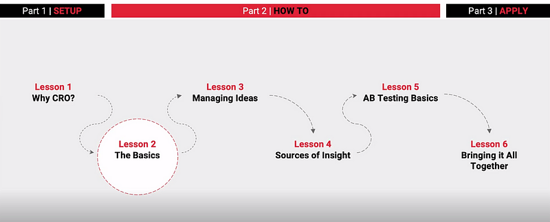
In the last blog, we learned about cditing & punching up the copy.

Even if we assume that your conversion rate is around 5%-10% that still means that the remaining 90% or 95% of your visitors are not converting! Surely that’s where you need to put your thinking caps on and think why did those 95% fail to convert even though you used highly targeted marketing to bring in relevant traffic that clearly had prior behavior or interest patterns suggesting that they would have been inclined to purchase your product or service.

Testing holds supreme importance in conversion rate optimization. In CRO, testing means that you need to identify the best possible version of your website. It ensures that the amount of effort you put in to bring in qualified traffic to the website converts into actual sales at a higher rate and brings in more revenue. Not only that, testing ensures that good customer experience leads to higher retention rates and hence increase CLV over time.

Importance of Correcting Mistakes:

The main point of testing is to identify flaws in your conversion funnel and take actions to correct them. It is also pertinent to point out that when doing CRO you need to have a buy in from all the stake holders most importantly, the tech team and your high-level management. All to often I have seen great CRO audits being done along with expertly crafted tests that propose the best versions of website landing pages only to be shot down by tech for not being included in their sprint planning or the boss thinks that more time could be spent on customer acquisition campaigns. So, if you are really going to go ahead with CRO then do it right and have the team buy-in.

Testing in CRO is a tricky business. Here are eight common testing mistakes and how you can avoid them.

Mistake#1 Not Letting A Test Run Long Enough:

Many marketers run their tests for a limited period of time and hence their test results are not statistically significant. In order to draw valid inferences from your tests, experts suggest that you should run test for at least a week. As Neil Patel puts it, CRO is a long-term game and you need to play by the book. You need strike a balance when it comes to the length of the test and how many conversions are good enough to draw reasonable conclusions.

Mistake#2 Testing Too Many Small Elements:

If you focus on testing minute features of landing features and not take a holistic approach to testing. Only then you are likely to draw the wrong conclusions from your test. Before going into testing, you need to draw a strategy where you identify elements that create a big impact, test them and then proceed to incremental changes.

Mistake#3 Just Testing Random Things:

Just don’t test random objects on the page. What you are testing needs to be backed by data e.g. a CTA button has achieved a high number of hovers but the click rate is no high thus requiring your intervention and testing various alternatives and finding the best version that gives you the right CTR. Before testing anything ask yourself, why do you want to test it and what should be the expected out come? Tests without a clear supporting hypothesis are bound to fail.

Mistake#4 False Positives:

In my experience I have learnt (mostly the hard way) that the number of iterations is directly proportional to false positive risks. One way to identify if you have a false positive on your hands is to test the winning iteration against itself and use back up tracking.

Mistake#5 Not Knowing When to Say When:

Running a test for far too log can also make it lose its validity. You need to cut out losing iterations quickly to focus on the ones creating significant results. Also, if no big improvements are coming in then you need to stop testing. Go back to the drawing board and re-strategize.

Mistake#6 Failing to Optimize for Each Traffic Source:

You need to test diverse traffic sources differently. For example, traffic coming from Desktop and Mobile behaves differently and your tests need to take this into account. A mobile user’s journey might entail discovery, awareness and creating buying intent but the same person could come to desktop to convert due to various reasons. Hence it is important to treat judiciously treat diverse traffic sources.

Mistake#7 Only Focusing on Conversion Rate:

Conversion rate without its proper context is useless. One of the most common mistakes while doing testing is focusing on final conversions and ignoring rest of the funnel. The point of testing is to ensure smooth user journey and that means optimizing all touch points in that funnel.

Mistake#8 Treating Low Traffic Websites the Same:

With low traffic sites, getting a statistically significant enough sample size is a real challenge. Employing the same tactics that would for high traffic sites when it comes to testing is a common mistake. One size fits all strategy rarely works. You need to outline the right time period and sample size for the test for it to produce valid inferences. Two ways to go around this problem are user testing and heuristic analysis of small groups. These are used to validate any changes or generate constructive feedback.

CRO tests bring high revenues when done correctly. If you can avoid these common mistakes your business can potentially end up saving a lot of money in these tough economic conditions.

RECEIVE WEEKLY LESSONS

    Understanding Message Hierarchies by Jibran Yousuf

    Understanding Message Hierarchies

    In this article, we will sharpen our understanding of Message Hierarchies.

    Before we dive deeper into the product messaging, I would like to mention that the following content is based upon the learnings that I did during the tenth Week of Conversion Optimization, my mini degree course at CXL Institute, led by Peep Laja & the team.

    • Understand how the fundamentals of the story can greatly improve your sales page’s persuasive impact.
    • Construct a killer value proposition for your product with some strategically collected voice-of-customer data.
    • Use Google Spreadsheets to instantly transform dry survey response data into a complete messaging hierarchy for any sales page.

    Understanding Storytelling & Message Hierarchies

    Why is the story critical to selling? You may have probably come across several talks that really get into this, the power of storytelling, all that kind of stuff. And the reality is, like, the reason that story is critical to selling is that that’s how humans think.

    Human thoughts tend to arrange themselves in a story. So synchronizing your copy, to the visitor’s thought sequence, often requires a story-based framework. And when we say story-like, we’re really talking about the beginning, middle, and end. That’s just how we tell stories. That’s how we communicate. It’s just the way we roll.

    So, if we want to go back to what a classic story framework looks like, we are taking a time warp back to 12th grade English class. Where you see a narrative arc like this. Where we talk about starting with setting the context, setting the scene, right.  What we’re really talking about is laying out the setting or the context. Once you’ve laid out the setting of the context, the who, what, where, when, you can get into the full story narrative.

    Best Practices for Conversion Rate Optimization by Jibran Yousuf

    Where you start talking about rising action and intensity, things start happening, tension starts building, until you get to some kind of climax or central conflict in the story. Then there’s the falling action. There’s the resolution of the story and it ends, right. We’re all very, very familiar with this. And if you don’t necessarily think that humans think in a natural story-based framework, I want you to read the next six words and tell me what comes into mind for you when you read them.

    goodbye mission control, thanks for trying.

    Six words, it is one sentence. But when you read that sentence, you instantly get, almost an entire story from that. Which is, there was a journey out into space. Something went horribly wrong, and now the astronaut is just flying off into the middle of nowhere. Great story.

    But you can see, human brains just have a natural tendency to just fill in those gaps, we fill in that story. You know, if you put the right words, in the right order. So, if you apply that story framework to a sales page, what do you get? Well, you need to set the context, first, right? You need the setting. We look at setting down the, for who, what are you selling, and why, the value proposition right. Here is when message hierarchies become relevant.

    You want to get that down, early. The moment people enter your sort of, story framework. From there, you get your features and benefits. You get to start diving into how the solution relates to that setting. And you start to build some excitement around the solution that you’re offering. This promise that you’re offering is right. So, it’s not so much tension, you don’t want to think about it in terms of tension because we’re not making people go through conflict, right. In the conventional sense of story. But we are trying to build excitement and anticipation around achieving a goal, right.

    So, we get into that rising intensity of laying out features and benefits, how it works, proofs, that kind of thing. The climax is when you pitch the sale. When you actually make the offer and you are getting them to act, you are getting them to overcome their own sense of inner tension and saying, “Yes, I’m going to go” and I’m going to buy this right now,” right. So, you put out your call to action, you want to get them to act. You want to give them a payoff. Right?

    So, when we say the call to action, a lot of people say the call to action in marketing, it’s become almost a blanket term or a very vague term that doesn’t really mean anything anymore we just hear it, and it’s just part of the buzzwords that we hear in marketing But, really what we’re trying to do is like, give the payoff like, you’ve built the anticipation towards the acquisition of some awesome thing.

    Now, the call to action is where you make that gateway where they can say, “Oh, this is where I go, to actually” achieve all this, you know, to get the result” of what you’ve been telling me about. “And then, of course, you have incentives that you want to include, at that moment to help get them over the hurdle. You have the actual falling action which is them just filling out the form and going through the process of following through on their commitment to act. And then finally the resolution is your post-conversion user experience. That is again marketing experiments way, of sort of, framing your sales narrative in the terms of story.

    One way that I love, is just thinking about it like this; you’re setting and context is where you start with the why. If you can’t convince someone or if you don’t start with the why, why should I be listening to you? Why are you even talking to me? What is this about? You don’t set that context, you’ve lost them, right.

    So, you need to start with the why. Then you want to let them try. If you’ve intrigued them with the why, and the context makes sense to them, and the promise, the value proposition that you put out to them is relevant to them, then the natural thing they’re going to think is; Okay, all right, tell me more. Right? Gimme the gist, gimme more details of what you’re offering. Right? So, you’ve got to think in terms of why, and then try.

    Try all the content that you use to kind of, get them to understand the product, and understand how it achieves their goals for them. And then you end with the buy. Allow them to act. Give them the opportunity, the gateway, the portal, to be able to get the thing that you’ve just…

    The solution that you’ve just offered them. Right? So, it’s very simple.

    Why try, buy, and that’s really what you need to be thinking about in terms of the flow of the story when it comes to a sales narrative. I hope you now have a better understanding of message hierarchies. Read more about Editing & Punching Up Your Sales Copy.

    RECEIVE WEEKLY LESSONS

      Crafting Effective Unique Value Propositions by Jibran Yousuf

      Crafting Effective Unique Value Proposition

      • What is the Value Proposition?
      • Why is it important?
      • Are they only critical to sales narrative online or they are important offline too?

      In this article, we will sharpen our understanding of what a Unique Value Proposition actually is.

      Before we dive deeper into the product messaging, I would like to mention that the following content is based upon the learning that I got during the ninth Week of Conversion Optimization, my mini degree course at CXL Institute, led by Peep Laja & the team.

      Understanding Value Proposition

      In every marketing textbook, you will find a discussion on understanding the value proposition yet people have a limited understanding of what it actually is and why it matters. In the last article, we discussed the Conversion Heuristic Formula.

      C = 4M + 3V + 2(I-F) – 2A

      Analyzing this formula, notice that the biggest, most influential element is Motivation.

      • What is going on in your prospect’s minds when they hit the page?
      • Their expectations?
      • What are they looking for?

      There are so many questions, yet we cannot control them. We might be able to influence the visitors’ motivation to visit the page, but the entire control is not possible. Then what can we control? The next biggest element, Value Proposition.

      Let’s look at the most widely used meanings of Value Proposition.

      1. What’s In It For Me? (WIIFM)
      2. Why should I choose you over X?
      3. What is your differentiator?
      4. What’s your unique advantage?
      5. What’s the reason to buy from you?

      Creating A Value Proposition

      Now that we understand what is a value proposition, let’s dive into how to create effective value propositions. Before moving forward, we will be using the first 2 meanings/questions of value propositions.  Listing them down in a sequential manner:

      1. Gather your team & stakeholders.
      2. Ask them, What’s In It For Me?
      3. Once someone answers that, ask that person, Why should I choose you over X?
      4. Don’t stop here, as soon as you get the answer, just ask So What?
      5. Don’t stop yet, ask again, Okay, prove it.

      The objective is to stress test your value proposition so so what & prove it over and over again, that you actually get virtually anyone excited, about the promise that you are giving them.

      How To Brainstorm the BEST Unique Value Proposition

      Keeping in mind that brainstorming the best value proposition is really about the most promising value proposition but then you really should try to validate it with external research as early as you can. These are the steps that are recommended to take.

      List Your Product’s Key Features

      1. Pinpoint Those That Are Unique
      2. List Customer Pain Points for Each Feature
      3. Define Desirable Outcomes for Each Pain
      4. Score Pains/Outcomes by Severity & Frequency
      5. Edit Top>Scored Pain/Outcomes Into MVPs
      6. Score the UVPs (and go with the best one!)


      How To Conduct A Copy “Teardown” by Jibran Yousuf

      How To Conduct A Copy “Teardown”

      In this digital era, a website is mandatory for every business that is launched.  However, the effectiveness of these websites depends on several factors. In this article, we will focus on the basis of a copy teardown, which is an essential step in enhancing product messaging.

      Before we dive deeper into the product messaging, I would like to mention that the following content is based upon the learnings that I did during the eighth Week of Conversion Optimization, my mini degree course at CXL Institute, led by Peep Laja & team.

      If you are a startup, your website should be optimized for

      1. Building relationships with your customers
      2. Ultimately selling your product

      Every visit counts—especially if it’s a qualified visit.

      Basis Of Copy Teardown

      When we talk about conventional teardowns, the biggest problem is that page tear downs or their heuristic analogies, they can be hugely opinion-based, and when that happens people contend to just revel in channeling their inner Simon Cowell and just ripping a page to shreds based on just what they like or they don’t like.

      To avoid this, we will be focusing on three elements for the systematic copy teardown approaches backed by proven formulas.

      Basis of copy teardown.

      Image Courtesy: CXL Institute

      MECLab’s Conversion Heuristic Formula – Teardown Element #1

      In order to address the persuasive argument on the page affecting the conversion rate, MarketingExperiments’ came up with a formula (not an actual mathematical equation). This equation focuses on the probability of conversion, or in other words the probability that your visitor is going to make a purchase.

      Basis of copy teardown. - MarketingExperiments' Conversion Heuristic Formula

      Image Courtesy: CXL Institute

      Let’s discuss the elements in this formula.

      • C = Probability of Conversion – What is the probability of the prospects saying yes to your offer?
      • M = Motivation – Understand the prospect’s motivation and make sure that your messaging is aligned with that motivation.
      • V = Clarity of Value Proposition – What are you offering your prospects that they can’t get anywhere else?
      • I = Incentive – Special offers to incentivize customers to purchase their products.
      • F = Friction – Decreasing the friction, such as a low number of clicks to buy, easy checkout process, etc.
      • A = Anxiety – Take care of FUDs (Fears, Uncertainties & Doubts)

      Cialdini’s Principals Of Persuasion – Teardown Element #2

      One of the most cited books on Influence & Persuasion is Robert Cialdini’s Influence: The Psychology of Persuasion. First published in 1984, Influence remains an essential item for every marketer’s reading list.

      In Influence, Cialdini boils down the key ingredients into the following “weapons of influence”:

      Basis of copy teardown. -Cialdini’s 6 Principles of Influence/persuasion

      Image Courtesy: CXL Institute

      There are six original principles, whereas the seventh principle has been added pertaining to periodic updates to product messaging.

      A large part of the successful high-converting landing page lies in understanding and channeling that perfect mix of persuasive ingredients that convinces visitors to act.

      Let’s discuss the elements:

      • Social Proof – Target the tribal human nature, every time we are uncertain, we take cues from people around us.
      • Authority – In order to be trusted, you need to position your brand as an authority
      • Liking – People end up buying a particular product simply because we like the person selling it to us.
      • Scarcity/Urgency -People desire the things they perceive as less available. That’s the principle of scarcity.
      • Reciprocity – People are conditioned to follow the rule of “give and take”.
      • Commitment/Consistency – Align the external behaviors with inner beliefs and values. Focus on the rule of commitment and consistency.

      Claude Hopkins’ Scientific Advertising – Teardown Element #3

      Widely regarded as the first conversion copywriter, Claude Hopkins used to put promo codes in his ads that people had to use to get the offer. Based on these unique promo codes, he was able to track the conversions, effectively analyzing the results to continually improve his ad results.

      “We cannot go after thousands of men until we learn how to win one.” – Claude C. Hopkins

      Hopkins’s Rule #1: Be Specific

      A generic copy that summarizes a lot of things is more likely to be completely forgotten by people, as it lacks really fine, specific memorable details. If you want your copy to stand out, focus on the specificity. 

      “Platitudes and generalities roll off the human understanding like water from a duck. They leave no impression whatsoever… People recognize a certain license in selling talk as they do in poetry. A man may say, “Supreme in Quality” without seeming a liar, though one may know that other brands are equally as good … But just for that reason, general statements count for little. And a man inclined to superlatives must expect that his every statement will be taken with some caution. …But a man who makes a specific$claim is either telling the truth or a LIE. People don’t expect the advertiser to LIE.”

      Hopkins’s Rule #2: Offer Service

      “Remember that the people you address are selfish, as we all are. They care nothing about your interest or your profit. They seek service for themselves. Ignoring this fact is a common mistake and a costly mistake in advertising. …The best ads ask no one to buy … [They] are based entirely on service. They offer wanted information. They cite advantages to users. Perhaps they offer a sample … so the customer may prove the claims without any risk. Some of these ads seem altruistic.
      But they are based on a knowledge of human nature.”

      Hopkins’s Rule #3: Tell The Full Story

      “There is no fixed rule on the subject of brevity. One sentence may tell a complete story on a line like chewing gum. It may on an article like Cream of Wheat. But, whether long or short, an advertising story should be reasonably complete.”

      Hopkins’s Rule #4: Be A Sales(wo)man

      “There is one simple and right way to answer many advertising questions. Ask yourself: “Would this help a salesman sell the goods? Would it help me sell them if I met the buyer in person?” …Some argue for slogans, some like clever conceits. Would you use them in personal salesmanship? Can you imagine a customer whom such things would impress? If not, don’t rely on them for selling in print.” … When one tries to show off or does things merely to please himself, he is little likely to strike a chord which leads people to spend money.”

      So, are you ready to teardown your website copy using the above-mentioned formulas?

      P.S: If you found this post helpful, please share it on social media.

      RECEIVE WEEKLY LESSONS

        Best Practices For Conversion Rate Optimization – Part 6 of 6

        This is the sixth & last article in the series of 6 articles focusing on the Best Practices for Conversion Rate Optimization.

        Before we dive deeper into the Best practices for CRO, I would like to mention that the following content is based upon the learnings that I did during the seventh week of Conversion Optimization, my nano degree course at CXL Institute, led by Peep Laja & team.

        I have divided this article into six parts to ensure maximum readability & thorough understanding.

        In the last article, we discussed

        • Visual Hierarchy
        • FAQs on Website
        • Importance of Visual Design

        In this article, we will discuss,

        • Internal Search
        • Shopping cart pages
        • Ecommerce checkout pages

        Let’s get started.

        Internal Search

        It’s a well-known fact that people who perform searches on an e-commerce website, tend to convert better. If you are having more 20 products or pages, it would be highly beneficial to add the search functionality.

        Most of the time, people browse first as they don’t know what exactly they want. So they search with keywords, ending up on the particular product page if they find it. Let’s go through some of the best practices for the conversion rate optimization focusing on the internal searches.

        Make The Search Box Bigger

        Have you noticed how Amazon encourages search? They have added a search bar right at the top, with a dropdown menu for category selection just in case the visitor wants to refine its search.

        Apart from size, the location of the search bar also matters. Most of the time visitors have to look around for the search bar, which highly affects the conversion rate.

        Best Practices for Conversion Rate Optimization by Jibran Yousuf

        Image Courtesy: Amazon.com

        Product Images In The Site Search Window Boost Conversions

        The search bar has evolved a lot in the past few years. Some stores show results on their search results pages, however, a widely adopted best practices is to show search results right under the search bar when the query is being typed.

        Take a look at this t-shirt store, I searched for “Dragon” and instantly got results below the search bar, handy, isn’t it?

        Best Practices for Conversion Rate Optimization by Jibran Yousuf

        Image Courtesy: The Mountain

        Optimize The Search Function

        How can you make your search functionality better? Take care of these 3 basic add-ons.

        1. Enable autocomplete – visitors should get suggestions as they type.
        2. Show results even if the search query had typos.
        3. Avoid “No Results found” – show relevant results if there are no exact results.

        Shopping Cart Pages

        Shopping cart is one of the most critical pages for your website. As soon as a buyer adds their first item in the cart, they have progressed to shopping from browsing. Our job is to make sure they progress towards payment.

        What Should A Cart Addition Look Like?

        Every time an item is added to the cart, a confirmation must be shown to the buyer. It can be either a small popup on the right side, it can be a tiny toast or a simple animation. You can also show the cart on the right-hand side of the page as soon as they add their first product. This way they will be able to see the cart contents along with the total until the moment.

        Best Practices for Conversion Rate Optimization by Jibran Yousuf

        Image Courtesy: aztecasoccer.com

        The Product Is In The Cart, Now What?

        As we talk about the cart addition, what’s the suggested action now? Here are the two widely used approaches.

        1. Show ‘cart add’ confirmation and remain on the same page.
        2. Transfer the user onto the cart page.

        Both of the above-mentioned approaches have their own pros & cons, as it depends on the strategy for your industry. The metrics to keep in mind are:

        • Average transaction value
        • Average quantity per transaction

        Displaying Cart Contents Well

        How should your cart look like? Follow this checklist:

        • Product photos
        • Product name & price
        • Ability to remove, save for later, change details like size
        • Show the kind of payments they accept
        • Show total price with the option to change the shipping
        • A clear call to action
        Best Practices for Conversion Rate Optimization by Jibran Yousuf

        Image Courtesy: blissworld.com

        Get The Visual Hierarchy Right

        What is the most desired action on a shopping cart page? The “Continue To Checkout”button. If you have a website where people tend to buy a few products per order, make sure you show them two CTAs, one above & below the cart.

        Tip: This is a good time to address the FUDs (Fears, Uncertainties & Doubts), so include a few icons to indicate secure transactions. Also, show all the possible payment options as it has proven to have a positive effect on conversions.

        Don’t Make Coupons Prominent

        Have you ever visited the cart page, and realized you don’t have a coupon code? It hurts, right? You feel less special triggering the thought of buying something expensive than others.

        Buyers might leave the website to search for coupons on Google and might result in card abandonment.

        How to avoid this?

        Offer a “Got a coupon?” link or something similar, and clicking on the link makes an input field. Text links are not visually very prominent, so fewer people will pay attention to them.

        People who already have a coupon code will be looking for it – so unless you hid it really well, they will find it and will be able to apply their coupon code.

        Remind Them About Shipping And Security

        As we discussed in the last article about FAQs that all the questions must be addressed in the copy. Likewise, mention the mode of shipment, return policy, secure payment & related concerns on the page.

        Persistent Cart

        Persistent Cart not only improves the customer experience by combining guest and customer carts and allowing customers to start or finish check out from multiple devices, but it also increases conversion rates by reducing cart abandonment.

        Save all the items in shopping the cart when a customer logs in. When they log out or access the cart from a different PC, re-add those (previous) items into their cart.

        Ecommerce Checkout Pages

        Follow these simple tips to ensure maximum conversions:

        1. Leave credit card info for last
        2. Design a payment form that looks like an actual credit card
        3. Make it look secure
        4. Store credit cards in your system

        So, are you ready to implement some of the above best practices for the conversion rate optimization that we discussed?

        P.S: If you found this post helpful, please share it on social media.

        RECEIVE WEEKLY LESSONS

          Best Practices For Conversion Rate Optimization – Part 5 of 6

          This is the fifth article in the series of 6 articles focusing on the Best Practices for Conversion Rate Optimization.

          Before we dive deeper into the Best practices for CRO, I would like to mention that the following content is based upon the learnings that I did during the Second Week of Conversion Optimization, my nano degree course at CXL Institute, led by Peep Laja & team.

          I have divided this article into six parts to ensure maximum readability & thorough understanding.

          In the last article, we discussed

          • Home pages
          • Pricing & pricing pages
          • Website speed optimization

          In this article, we will discuss,

          • Visual Hierarchy
          • FAQs on Website
          • Importance of Visual Design

          Let’s get started.

          Visual Hierarchy

          A hierarchy is an organizational structure in which items are ranked according to levels of importance.

          When we talk about visual hierarchy, we focus on the order in which the human eye perceives the design.

          In web design, there are some sections or parts that are more important than others. These can be forms, having certain CTAs, value propositions. Since these are important, you would want them to get more attention and time.

          Remember, that visual hierarchy is not only about size, but also about color, & position of an element on the website.

          If you are having 5 identical buttons on your website, the user won’t be able to differentiate and you will always get random clicks. However, if you make a button prominent by changing its color, size, or position, you will be driving more clicks on that particular button.

          Start With The Business Objective

          The easiest way to prioritize elements is to rank them on the basis of your business objective.

          In order to understand this phenomenon and practice it, start visiting the website and rank them the elements in the visual hierarchy. Compare them with your own website. Do changes as per your analysis.

          Rank Your Most Wanted Actions For Every Page

          Once you are done with the landing page, head over to other pages. Identify the most wanted action on each of these pages. Make it stand out on the whole page.

          Example: ActiveCampaign wants the visitor to choose the Professional Plan, there can be several reasons for that. So they made it prominent by putting a badge of Most Popular and highlighting the plan with dark blue color.

          Best Practices for Conversion Rate Optimization by Jibran Yousuf

          Image Courtesy: ActiveCampaign

          FAQs On Websites

          Frequently Asked Questions (FAQs) is a list of answers to common questions about a product or service.

          The purpose of FAQs is to provide information on frequent questions or concerns.

          The question is, should a website has an FAQ section or not?

          For a marketer, the priority should be to eliminate the need for FAQs. If your audience has to read instructions to figure your product or service, you are not communicating the message correctly.

          There are many websites that put their whole pitches in FAQs disguised as questions, which is an absolute waste of space.

          If you are needing an FAQ section to explain your pricing, you must review your pricing page and the whole copy. Try to put the answers to FAQs in the copy.

          How to figure what to put in the copy? Just pay attention to the questions that are being asked via support emails, live chat & queries. Then put the answers to these questions into your website copy.

          Importance Of Visual Design

          What is your definition of the best design?

          The best design is the one that was driven by data and brings in the most money. Creativity is important, and an essential part of web designing but the decision should be taken on the basis of data.

          Why design is important? Humans process visuals 50 times faster than copy, and we are quick to judge. Period.

          Design affects the trust scale too. If you a poorly design website, visitors would instantly doubt your authenticity within milliseconds.

          Let’s talk about a few critical, & objective aspects of design.

          People Judge Websites In Less Than 50 Milliseconds

          Humans make snap judgments when they meet a new person; websites are judged similarly!

          As per the research conducted by Gitte Lindgaard, Gary Fernandes, Cathy Dudek & J. Brown. It was concluded that it takes about 50 milliseconds for visitors to form an opinion about your website.

          As per the research conducted by Google, visitors develop opinions even within 17 ms (though the effect was less pronounced on some design factors).

          The first impression depends on multiple factors, some of them are:

          • Structure
          • Color
          • Spacing
          • Symmetry
          • Amount of Text
          • Fonts

          First Impressions Are 94% Design-related

          As stated earlier, the design drives trust.

          There have been multiple studies, that concluded that design elements have the biggest influences on first impressions, including logo, main images, colors & the navigation menu.

          Human minds process visuals 50 times faster than the copy.

          Inspiration Drives Better First Impressions

          Impression-related impressions have a greater impact on the first-impression formation, followed by usability. Visual appealing stimuli are an important tool for getting visitors to stay on your website.

          If you are a tour operating website, using larger than life photography would really increase the gains.

          Have a look at the Active Adventures website, as they know how to capture people when they feel most inspired.

          Best Practices for Conversion Rate Optimization by Jibran Yousuf

          Two Key Ingredients Of Web Design People Like: Simplicity And Prototypicality

          Simplicity: As per a study by Google, in 2012, researchers found that simpler & familiar design is better, as compared to visually complex websites.

          The simpler design promotes less noise, which means fewer distractions. Simplicity is about focus & clarity of the purpose that should make the visitors instantly understand what’s going on, leading to the singular goal of the page.

          Prototypicality: The human mind creates a template of everything that it interacts with. When we put the same phenomenon on websites, the human mind creates a blueprint of how a SaaS website, blog, or e-commerce site should look like.

          If you change the design too much in the pursuit of innovation, it might backfire.

          Stop Arguing Over Opinions. Data-driven Design Is The Way: Measurable Approach To Better Design

          If it can be measured, it can be improved.

          There are several tools that let you assess your design, measure the clicks, and analyze the funnel. How long they stay, and what errors & issues make them leave the website.

          The whole point of data-driven design is to use the data to identify what’s working and what’s not, and to improve productivity.

          So, are you ready to implement some of the above best practices for the conversion rate optimization that we discussed?

          P.S: If you found this post helpful, please share it on social media.

          RECEIVE WEEKLY LESSONS

            Best Practices For Conversion Rate Optimization – Part 4 of 6

            This is the fourth article in the series of 6 articles focusing on the Best Practices for Conversion Rate Optimization.

            Before we dive deeper into the Best practices for CRO, I would like to mention that the following content is based upon the learnings that I did during the Second Week of Conversion Optimization, my nano degree course at CXL Institute, led by Peep Laja & team.

            I have divided this article into six parts to ensure maximum readability & thorough understanding.

            In the last article, we discussed

            • Principles of persuasive design
            • Typography and content
            • Radical redesign vs. evolutionary design

            In this article, we will discuss,

            • Home pages
            • Pricing & pricing pages
            • Website speed optimization

            Let’s get started.

            Home Pages

            Whenever a home page is designed, there are two goals as the main objectives.

            1. Provide information to the user/visitor
            2. Provide useful links via top-level navigation for all the related additional information

            As we dive deeper into the home page design, we come across the third goal or you can term it as the secondary goal. The secondary goal is to send visitors to the sales funnel. In order to achieve this, you have to work on the page fold, CTAs and visuals to lead the visitor in a particular direction.

            To assess a home page, we look for answers to the following questions

            1. Does the page have a clear value proposition?
            2. Is there a single, clear primary call to action?
            3. Are there links to additional information?

            Have a look at the home page of Slack and analyze it as per the above questions.

            Best Practices for Conversion Rate Optimization by Jibran Yousuf

            Courtesy: Slack.com

            CXL conducted a study to evaluate the value proposition presentation and came around some interesting insights.

            • The value proposition should be bigger intriguing the participants to notice it and focus on it.
            • Bullet lists are preferred over a short paragraph.
            • If you increase the benefits, it is easier for the visitor to recall a significant number of them.

            However, it’s not recommended to blindly copy a home page, assuming it would yield similar results for your website as well. So keep experimenting by trying out different copies, visuals & layouts.

            Pricing & Pricing Pages

            The pricing page is the goal line to the business objective; It’s the point at which a buying decision is made.

            We, as a business owner put so much time, sweat equity, and love into our products, but when the time comes to set up our pricing and build out our pricing page we spend only around a few hours arguing amongst our teams before deciding the number backed by a few discussions. As we talk about the best practices for conversion rate optimization, pricing page plays an important role in determining the growth of your business.

            The Higher The Price Point, The More You Need To Explain

            How much time would you spend on taking the decision if the product price is 1$? Minutes or even seconds. But if the product is being sold for 1000$, now? You would want to know more information or consult the product representative, take a look at reviews, or even read the FAQs.  In other words, the more expensive your product or service is, the more content needs to be in front to back your pricing.

            Don’t Ask People How Much They Would Pay

            Instead of asking people to suggest the pricing, create a simple formula around it. Test the pricing with actual traffic and experiment with a few numbers until you come up with a rational price that performs well.

            Things That Typically Work Well And You Should Experiment With

            • Multiple prices vs. one price – list multiple packages with proper differences so they can decide which one is the best for them.
            • Decoy pricing – a tricky scenario where one package is given an upper hand to ease the buyer’s decision
            • Price Anchoring/Contrast principle – create multiple packages, having a huge difference, causing the customer to buy the cheaper pricing package/plan.
            • Decoy + Contrast – use the above two points to create a pricing strategy for different packages.
            • Price ending with 9s – do you think $9 price ending increases demands? Yes, and it’s backed by a number of case studies.

            Should You Always Reveal The Prices (even in B2B)?

            Definitely, if your competitors are disclosing the pricing on their website, whereas you are offering the visitor to request a quote, you will lose a lot of business. Most of the time, visitors are too impatient to request a quote.

            However, if you don’t have fixed prices, you can always put a few slabs for the visitors so they would have an idea of estimated pricing. This practice will also ensure better qualified leads.

            Best Practices for Conversion Rate Optimization by Jibran Yousuf

            Image Courtesy: Logz.io

            Some Best Practices/tips For Optimizers To Consider When Assessing Pricing Design

            1. Make it easy for the visitor to understand the differences between plans.
            2. Help the people identify the right plan for themselves.
            3. Address FUDs (fears, uncertainties, doubts).
            4. Offer multiple currency options to aid their buying decision
            5. Give a discount on annual plans
            6. Display a clear call to action

            Website Speed Optimization

            Website speed optimization affects the instantaneous gratification of the visitor. You wouldn’t want your website to take extra time to load as the visitor would instantly shift the focus on any other tab on the browser. A fast loading website can have positive effects on everything from user experience to bounce rate, time on site, and other important metrics.

            Ideal Site Speed

            Jakob Nielsen, who holds a Ph.D. in human-computer interaction, says 10 seconds can be the maximum loading time for a website.

            Let’s take a look at some interesting stats:

            Image Courtesy: Google PageSpeed Insights & Nonfig

            Tools To Evaluate Site Speed

            All of these tools make it simple to test your site’s performance – usually, it’s as easy as pasting in your site’s URL and letting the tool work its magic.

            Best Practices for Conversion Rate Optimization by Jibran Yousuf

            Tip: Check speed info in Google Analytics by visiting speed reports under the Behavior.

            Best Practices for Conversion Rate Optimization by Jibran Yousuf

            So, are you ready to implement some of the above best practices for the conversion rate optimization that we discussed?

            P.S: If you found this post helpful, please share it on social media.

            RECEIVE WEEKLY LESSONS

              Best Practices For Conversion Rate Optimization – Part 3 of 6

              This is the second article in the series of 6 articles focusing on the Best Practices for Conversion Rate Optimization. You can read the second part here.

              Before we dive deeper into the Best practices for CRO, I would like to mention that the following content is based upon the learnings that I did during the Second Week of Conversion Optimization, my nano degree course at CXL Institute, led by Peep Laja & team.

              I have divided this article into six parts to ensure maximum readability & thorough understanding.

              In the last article, we discussed

              • E-commerce Category Pages
              • E-commerce Signups
              • Incoming Phone Leads & Call Tracking.

              In this article, we will discuss,

              • Principles of persuasive design
              • Typography and content
              • Radical redesign vs. evolutionary design

              Let’s get started.

              Principles Of Persuasive Design

              The literal definition of Persuasion is, “In business, persuasion is a process aimed at changing a person’s (or a group’s) attitude or behavior toward some event, idea, object, or another person (s), by using written, spoken words or visual tools to convey information, feelings, or reasoning, or a combination thereof.”

              When we talk about Persuasive Design, it resonates with the effort that the marketer does to trigger a specific action by the visitor on your website.

              Do you know what tactics Gary Vaynerchuk uses to persuade his audience? He talks fast, acts confident, guards them & swears a bit here and there too.

              Let’s discuss the five principles of Persuasive Design

              1. Clarity Above All

              As soon as the visitor lands on your website, the human brain starts to process the copy & design. Some of the common questions are, what is it? What can I do here? How is it useful to me? If your copy & design are apparent in the first few seconds, your bounce rate will decrease, and the average time would be positively impacted. However, if you use long sentences, and words that sound more like riddles, the visitor will instantly lose the focus.

              Best Practices for Conversion Rate Optimization by Jibran Yousuf

              Courtesy: overflow.io

              2. Visual Appeal

              The human brain processes visuals 50 times faster than the copy. Whatever you do, make sure your website has compelling visuals. So, if you are selling physical products, show the best pictures. If you are selling services or SaaS tools, show the screenshots. Google recognizes two factors that determine visitors would like the website or not.

              1. Low visual complexity – the simplicity of design of the website
              2. High prototypicality – how familiar is the layout that you used
              Best Practices for Conversion Rate Optimization by Jibran Yousuf

              Courtesy: Logz.io.

              3. Visual Hierarchy

              When we talk about using visuals, we tend to focus on the design that prioritizes the objective of the website. As the first impression, the visitors notice the main design, the CTA, discount offers banner, or maybe the copy that you wrote as the highlighted headline. Now, if you want any of these to stand out, you have to give them appropriate size along with a color that makes it visible more than any other element as the first impression.

              don’t forget that visual hierarchy is not about correctly stuffing everything. It’s also about the correct usage of white spaces to make the overall design look more straightforward, and the attention remains on the main element.

              4. Conserve Attention At All Costs

              Now that you have prioritized clarity maintained a visual hierarchy and used highly captivating visuals. It’s time for you to keep them hooked to your website. How would you sell your photography services? You can put high-quality images of your previous work and keep showing them until, at the end of the scroll, they find your fees or a form to contact you. Since you have already captured their attention, it would be easier to sell to them.

              5. One Action Per Screen, When They’re Ready

              How many pages does your website have? What are the most desired goals of these pages? Determine the actions. Every page on your website must have a single CTA, that should be most prominent, and visible. However, the CTAs, or triggers should be placed carefully, after analyzing the peak of motivation for that particular action. Poorly placed CTAs would harm your conversion rate.

              The goal of persuasive design is to make sure the fold area is distinct, creating a value proposition statement, and giving people enough reason to scroll down.

              Typography And Content

              Typography focuses on adjusting the text within the design while creating compelling content. It provides an attractive appearance and preserves the aesthetic value of your content. When we talk about best practices for conversion rate optimization, typography plays a vital role in setting the overall tone of your website and ensures a great user experience.

              Let’s understand this with the help of a few questions.

              Best Practices for Conversion Rate Optimization by Jibran Yousuf

              What’s the best font size and type?

              The recommended smallest size is 16 pixels for body copy. However, smaller font sizes can be used for mentioning help texts such as instructions for form labels, etc. Apart from font size, line height needs to be carefully assessed too. Headlines & CTAs would be more significant & prominent.

              Is there a best font?

              No, however, some standard fonts are used mostly as they are easy to read, such as Arial, Georgia, or Tahoma. If you are using a new font that forces the visitor to apply extra focus on understanding the text, you will affect the readability negatively.

              How to structure the copy?

              The recommended approach is

              • using ordered and unordered lists,
              • serving images with text to break it up,
              • new paragraph every 3-4 lines,
              • sub-headline every 1-2 paragraphs.

              Is there an optimal line length?

              As most studies confirm, the ideal length is around 50-75 characters.

              If the length exceeds, the reader will have a hard time focusing on the text.

              If you have lesser characters, the visitor’s reading rhythm would be disturbed now and then.

              What gets read?

              To answer this, I am mentioning the most favorable structure of copy that is easy for the eyes to scan.

              • Headline (#1)
              • Intro paragraph,
              • Bullets above the fold,
              • Sub-headlines.

              Best Practices for Conversion Rate Optimization by Jibran Yousuf

               The amount of text that read by a great deal is reduced due to poor content. Don’t try to save money by hiring a cheap copywriter, as it will drastically affect the conversion rate.

              Radical Redesign vs. Evolutionary Design

              As we talk about the best practices for conversion rate optimization, we think of A/B testing as the primary tool for the optimization of the current design. But, now and then, a scenario comes where you get confused whether you continue optimizing the existing site, or scrap it and do a radical redesign instead? And it’s not such a simple decision as it seems,

              Local Maxima

              The point where despite your continuous changes to the design, the effects are close to negligible or non-existent, is called the Local Maxima. This is also the point where the conversion analysts have to make a decision. Either they go with more updates to the current design (evolutionary design approach) or choose to redesign of the page. This decision heavily relies on the data along with their intuition.

              Best Practices for Conversion Rate Optimization by Jibran Yousuf

              Courtesy: Andrew Null

              How To Decide When To Redesign?

              The first simple answer to this much-debated question is to assess if it’s brand & identity redesign? If yes, the optimal solution is to start over. Otherwise, go through the conversion research, identify the issues, and make sure you note down everything that is working. As it’s preferable that the new design includes all the positive aspects of the previous design.

              When is Radical Design Better?

              • You’ve hit the Local Maxima.
              • Outdated tech-stack and legacy technologies are used.
              • The design layout is not the standard practice anymore.
              • Conversion analysis has revealed a considerable number of design issues.

              When is the Evolutionary Approach Better?

              • You have space and ideas to test with a high probability of significant effects on conversion rate.
              • A large number of returning visitors have adopted your current design.

              Best Practices for Conversion Rate Optimization by Jibran Yousuf

              So, are you ready to implement some of the above best practices for the conversion rate optimization that we discussed?

              P.S: If you found this post helpful, please share it on social media.

              Follow my blog with Bloglovin

              RECEIVE WEEKLY LESSONS

                Best Practices For Conversion Rate Optimization – Part 2 of 6

                This is the second article in the series of 6 articles focusing on the Best Practices for Conversion Rate Optimization. You can read the first part here.

                Before we dive deeper into the Best practices for CRO, I would like to mention that the following content is based upon the learnings that I did during the Second Week of Conversion Optimization, my nano degree course at CXL Institute, led by Peep Laja & team.

                I have divided this article into six parts to ensure maximum readability & thorough understanding.

                In the last article, we discussed

                • Web Forms
                • Buttons & Call To Action
                • Fold & Page Length

                In this article, we will discuss,

                • E-commerce Category Pages
                • E-commerce Signups
                • Incoming Phone Leads & Call Tracking.

                Let’s get started.

                E-commerce Category Pages

                best practices for conversion rate optimization - jibran yousuf

                The objective of every e-commerce category page is to help visitors find something they like, want, or need. We can help potential buyers with the following strategies.

                Narrow Down Choice

                Every e-commerce store offers a variety of products. Let’s start with filters. Filters are an essential component. Based on your store, you can either put the filters right on top or on the left-hand side.

                Along with the filters, you can put product badges to help some products stand out. These can be the ones you have a higher margin on, or maybe in large quantity. Sometimes you go to a restaurant, and you are unable to decide anything. So you just look at Staff Pick for Today, because that sounds like a safe option. That is precisely how Product Badges work.

                Sort Products

                Just like filters, sorting is an essential component of an e-commerce store. Organized products are always better than clutter. Usually, the sorting choices are by price, customer rating, newly added & so on. Make sure this sorting feature is right in front of the customer.

                One of the best examples of Narrowing down the choice & sorting can be seen at J. (Junaid Jamshed) online store.

                best practices for conversion rate optimization - jibran yousuf

                “Is it for me?”

                Three essential factors back every buying decision.

                1. Product photo — must be bright & large enough.
                2. Product name & description — concise info about the product always increases the sales.
                3. Price — make it prominent.

                There have been several instances, where a store experienced a hike in sales just by updating the photos of the page. Visitors want to see the product by every angle, give them the highest quality photos with a feature to rotate & zoom.

                Focus Of The Page

                If your page has anything that distracts the customers from buying the product, evaluate & eliminate it. Some of them (MIGHT BE) are

                • Cluttered sidebars
                • Banner ads, Google AdSense
                • Email opt-ins
                • Random clutter

                Apart from the above, you should have breadcrumbs on your site. They enhance the usability of the website. Make sure the Call To Action is prominent & clearly defined.

                best practices for conversion rate optimization - jibran yousuf

                When optimizing category pages, don’t think specific tactics or implementation. Instead, use a structured approach to evaluate whether the page helps people

                Ecommerce Signups

                How many times it happened that you added a product to your cart, proceeded to checkout. And you were asked to signup as a necessary step? Too many times.

                1 in 4 abandon online purchases due to forced registration.

                The approach to force registration is part of Greedy Marketer Syndrome that I mentioned in my last article. There is a myth that if a person signs up to an e-commerce store, that will start a never-ending loyal relationship — absolute bad practice.

                So, what are the best practices?

                1. Use better terminologies such as New & Returning customers, instead of register.
                2. Only ask for their email on checkout, this would ensure you can email them even if they abandon the cart.
                3. Introduce Guest Checkout, and give them the option to register, if they want. (Associate a benefit with registering an account)
                4. Use social logins, such as Google & Facebook. Highly recommended and widely implemented now.

                best practices for conversion rate optimization - jibran yousuf

                Incoming Phone Leads & Call Tracking

                Many business rely on phone calls for their everyday operations. If you look at the Real Estate industry, it’s an essential step to talk with an agent over the call. There can be several use cases where businesses prefer calls over emails.

                best practices for conversion rate optimization - jibran yousuf

                Phone Calls = Conversions!

                If you want people to call, you have to work similarly as you work when you want them to buy something from you. Likewise, phone calls can be increased when you optimize your flow to achieve that.

                Optimizing For More Incoming Calls

                As we talked about optimizing the website for increased conversions, likewise, optimization for phone calls follow similar principles.

                Add Phone Numbers Into Your PPC Ads

                One of the ideal places to put the phone number is in the ad itself. Seeing a phone number encourages the customer to call, as they know they can directly communicate with a human.

                Carefully analyze your audience, craft the ad copy & design, and test what works best for you.

                Give Them A Reason To Call

                The need drives every action by the visitor. Create a list of benefits that you are offering. Test them one by one, maybe put them in groups too. Analyze which reason triggers more visitors to call.

                You can come up with a unique offer to increase the phone calls too.

                Put The Offer In The Right Places.

                As we talked about the most critical content in the top fold, you should be putting the phone number where the customers can see it easily.

                Try putting it in the top half of the content, & in the footer. You can even put a decent popup that gets trigger if the customer scrolls down to the bottom.

                best practices for conversion rate optimization - jibran yousuf

                Set Up Phone Tracking With Google Analytics

                Tracking phone calls has multiple benefits.

                1. Which page is triggering the most calls?
                2. What was their previous action before the call? Did they scroll to the bottom? Or made the call from the popup?
                3. You will also know which strategy is getting you more calls, very useful.
                4. You can also see which PPC or SEO keywords they used.

                Adding an analytics event or tag for phone calls will get you very reliable data, & it is easy to implement.

                So, are you ready to implement some of the best practices for the conversion rate optimization that we discussed?

                P.S: If you found this post helpful, please share it on social media.

                RECEIVE WEEKLY LESSONS

                  Introduction To Conversion Rate Optimization

                  If we analyze the paradigm shifts of the Internet, we come across three paradigms in the past three decades, starting from the 1990s, with Yahoo & Lycos, to Google in the 2000s, followed by Social Media sites in 2010s.

                  Photo by Leon Seibert on Unsplash

                  And now the Internet is easily accessible by almost everyone, even in remote locations, which intrigued the businesses to grow their digital presence. And now every industry, including eCommerce stores, SaaS businesses, non-profit organizations, or even political campaigns, focus on their online presence. Now they all own a website, has their location on Google Map, takes online orders & sell their services, and influence the people around the globe right from their comfort of home.

                  Analysis of customer behaviour shows that between 70–80% of people research a company online before visiting a small business or making a purchase with them. 97% of consumers go online to find a local store or local services.

                  These paradigm shifts not only introduced a new scope of work but also added several new growth & marketing strategies & tactics to be implemented online for the hypergrowth of startups, & established businesses.

                  In this article, we will discuss one of the essential processes in growth marketing, i.e. Conversion Rate Optimization or as we call it CRO.

                  Conversion Rate Optimization (CRO)

                  Before we dive deeper into the CRO, I would like to mention that the following content is based upon the learnings that I did during the First Week of Conversion Optimization, my nano degree course at CXL Institute, led by Peep Laja & team.

                  This course’s lectures were conducted by Brian Massey, the Managing Partner at Conversion Sciences.

                  Introduction To Conversion Rate Optimization

                  When we talk about online marketing, there are two ways to increase your revenue. Either you start driving more traffic to your website to increase sales, or you improve the overall website effectiveness to increase the number of people who purchase something from you. Conversion Rate Optimization (CRO) focuses on the second way. Let’s get started.

                  Conversion Rate Optimization

                  Why CRO?

                  Let’s consider that you have a website, and you are not getting enough conversion, visitors are not purchasing your products, your services are not selling, and you are not getting enough leads to convert them.

                  There are two ways to tackle the current situation. Either design a new website landing page OR gather the data based on current visitors, & analyze it. Based on this analysis, update the chunks of website layout design. Which one sounds better? I am sure you would go for the latter. However, Fishline.com went for the first one, in November 2012, and updated the whole website layout.

                  Finish Line Website on November 18, 2012
                  Finish Line Website on November 19, 2012

                  This step, damaged Finish Line business with an estimation of 3 Million US Dollars with a few weeks. This is where CRO comes into play, enabling you to do test-driven updates to your website, minimizing the risk factor of crashing the business.

                  CRO primarily focuses on the following:

                  • Decrease the Cost per Acquisition (CAC)
                  • Increase the number of leads
                  • Get more sales

                  So If your business has fewer leads, high bounce rate with a high cost of acquisition, you must focus on CRO processes to grow your business exponentially without risking the current growth.

                  The Basics

                  When we talk about improving the Conversion Rate, try sharing this objective with the colleagues around you. You will be bombarded with ideas, from your team, your boss, or the ideas that you took as inspiration from your competitors.

                  And most of the time, these ideas make their way onto the live website, without a proper framework to validate all those ideas. This happens due to several reasons, sometimes due to the political will of your superiors, while sometimes due to your confirmation bias of the idea that you suggested.

                  How to avoid this problem? Most of the people would say, let’s learn how to manage these ideas. No, the human brain has the built-in ability to distinguish ideas. We use this ability in our daily lives. Now, remember how many times you analyzed the current situation and curated a perfect status update or tweet for your social media profile, that brought a lot of engagement?

                  The last time you bought a product from Amazon, you got stuck between two variants, and you quickly went into reviews to decide which one to buy? All of these are the example that the CRO mindset is already wired into our brain; we just need to use in our business.

                  Understanding Conversion Rate Optimization
                  Photo by Raquel Martínez on Unsplash

                  The above examples are also the daily life example of A/B testing. As you compare two updates, analyze the data, and choose the one that benefits you at most.

                  Now that you have an idea of what CRO is, we will talk about the three founding pillars:

                  • Managing the ideas
                  • Increasing the sample size
                  • Improving the quality of the sample.

                  Managing Ideas

                  Managing Ideas for Conversion Rate Optimization
                  Photo by Aaron Burden on Unsplash

                  Ideas are the oxygen for a digital marketer, that is large in number. As I said before, share the objective with your team, and you will be quickly having 10–20 ideas within an hour. Our brain is programmed to have multiple ideas. So how to decide which one is worth trying? And how to politely decline the idea of your boss or any senior authority in the business?

                  Simply, create a spreadsheet, and write down all the ideas in that list, gather it from the team & even from your boss.

                  Writing A Hypothesis

                  Now, write a hypothesis for every idea, in the given format.

                  The hypothesis to enhance ideation

                  Taking an example of Nonfig, I had the idea to change the text on the CTA button in your lead opt-in form on your main landing page, so I wrote the hypothesis for that.

                  If I update the CTA button text of opt-in form to Claim Your Free 3 Months
                  I expect to get more leads.
                  As measured by Number of leads in Google Analytics

                  Ranking Ideas

                  Once you are done with the hypothesis, rank your ideas based upon these three factors, usually rating them from 1 to 5.

                  • Impact — the effect of the idea post-implementation
                  • Confidence or Proof — the probability of achieving the desired impact
                  • Effort to Test — the amount of work required to conduct this test

                  Updating the CTA button text can create a significant impact, has the credibility to succeed based on the Copytesting rules, and the effort to test this change is minimal. Whereas changing the graphical assets used on the landing page from photos to vector might create a huge impact too. But the effort to test is high, and therefore we know the first test can be easily prioritized.

                  Sources Of Insight

                  Whenever we talk about initiating a test, it’s recommended to analyze the ideas based upon a number of data sources.

                  First of all, Google it. In this continually changing world, a number of marketers are regularly running tests and putting their findings on the web. Go through them, and check if your ideas are even testable or not.

                  Find out what is required to execute these ideas, maybe some just need a simple fix, whereas some need an update in layout design.

                  Gather Insights for Conversion Rate Optimization
                  Photo by Stephen Phillips – Hostreviews.co.uk on Unsplash

                  One of the most recommended sources of data is your website analytics, and it has everything that you are looking for before running a test. Analytics can help you save hours of work, and you will be able to understand the visitor behaviour more accurately analyzing the patterns.

                  Apart from the above, many tools give you insights and save you from the disappointment of running a test that shouldn’t be run in the first place. A few of these tools are:

                  • Hotjar — provides feedback through tools such as heatmaps, session recordings, and surveys.
                  • SessionCam — provides a click heatmap, a scroll map, and a screen recording feature to view how users behave on pages.
                  • Tobii — focuses on sensor technology that makes it possible for a computer or other device to know where a person is looking.

                  A/B Testing Basics

                  A/B Testing in Conversion Rate Optimization

                  Whenever a person listens to the term Conversion Rate Optimization, their mind instantly thinks of A/B Testing. However, CRO is much more than just A/B Testing.

                  A/B Testing is the best way to collect visitors’ behavioural data by presenting them with different versions of a creative, or layout, or even a copy on your website.

                  When we talk about getting feedback about a particular feature, or an update, we consult it with our team, our friends, & the family circle. Most of the time, the feedback is not accurate, and they act as pretenders & liars.

                  A/B testing allows you to run the test, with both ends. As they both ends do not know the actual person behind the insight that you receive. CRO specialists will only get the numbers in forms of analytics. Whereas the visitor won’t even know that they are being tested, so their response is natural.

                  The key to running A/B Testing is to understand which tests need to be run. This is vitally important to avoid running tests where they are not required. Also, keep in mind that it’s not necessary that the test variant that you are supporting only because of your own confirmation bias will lead the test.

                  Bring It All Together – Conversion Rate Optimization

                  Conversion Rate Optimization is one of the fundamental processes of Growth Marketing. We learned what CRO is & why is it important. We also shed light on how great ideas are lost, while ideas supported by political will make it to the top. However, we came across the framework to manage ideas. Insights are essential. Once you have the list of sources of raw data, combined with the powerful features of excellent tools, it becomes the perfect recipe to run A/B Tests.

                  In the next article, I have discussed the Best Practices for the CRO.

                  Do you have any questions? Feel free to ask in the comments section below.

                  RECEIVE WEEKLY LESSONS