Best Practices For Conversion Rate Optimization – Part 6 of 6
This is the sixth & last article in the series of 6 articles focusing on the Best Practices for Conversion Rate Optimization.
Before we dive deeper into the Best practices for CRO, I would like to mention that the following content is based upon the learnings that I did during the seventh week of Conversion Optimization, my nano degree course at CXL Institute, led by Peep Laja & team.
I have divided this article into six parts to ensure maximum readability & thorough understanding.
In the last article, we discussed
- Visual Hierarchy
- FAQs on Website
- Importance of Visual Design
In this article, we will discuss,
- Internal Search
- Shopping cart pages
- Ecommerce checkout pages
Let’s get started.
Internal Search
It’s a well-known fact that people who perform searches on an e-commerce website, tend to convert better. If you are having more 20 products or pages, it would be highly beneficial to add the search functionality.
Most of the time, people browse first as they don’t know what exactly they want. So they search with keywords, ending up on the particular product page if they find it. Let’s go through some of the best practices for the conversion rate optimization focusing on the internal searches.
Make The Search Box Bigger
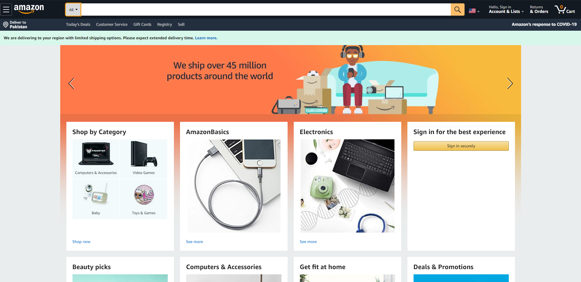
Have you noticed how Amazon encourages search? They have added a search bar right at the top, with a dropdown menu for category selection just in case the visitor wants to refine its search.
Apart from size, the location of the search bar also matters. Most of the time visitors have to look around for the search bar, which highly affects the conversion rate.

Image Courtesy: Amazon.com
Product Images In The Site Search Window Boost Conversions
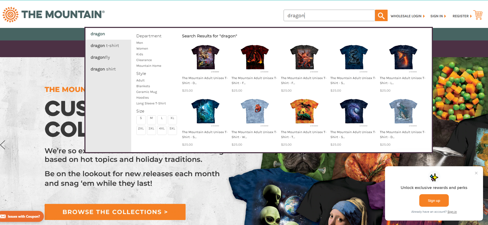
The search bar has evolved a lot in the past few years. Some stores show results on their search results pages, however, a widely adopted best practices is to show search results right under the search bar when the query is being typed.
Take a look at this t-shirt store, I searched for “Dragon” and instantly got results below the search bar, handy, isn’t it?

Image Courtesy: The Mountain
Optimize The Search Function
How can you make your search functionality better? Take care of these 3 basic add-ons.
- Enable autocomplete – visitors should get suggestions as they type.
- Show results even if the search query had typos.
- Avoid “No Results found” – show relevant results if there are no exact results.
Shopping Cart Pages
Shopping cart is one of the most critical pages for your website. As soon as a buyer adds their first item in the cart, they have progressed to shopping from browsing. Our job is to make sure they progress towards payment.
What Should A Cart Addition Look Like?
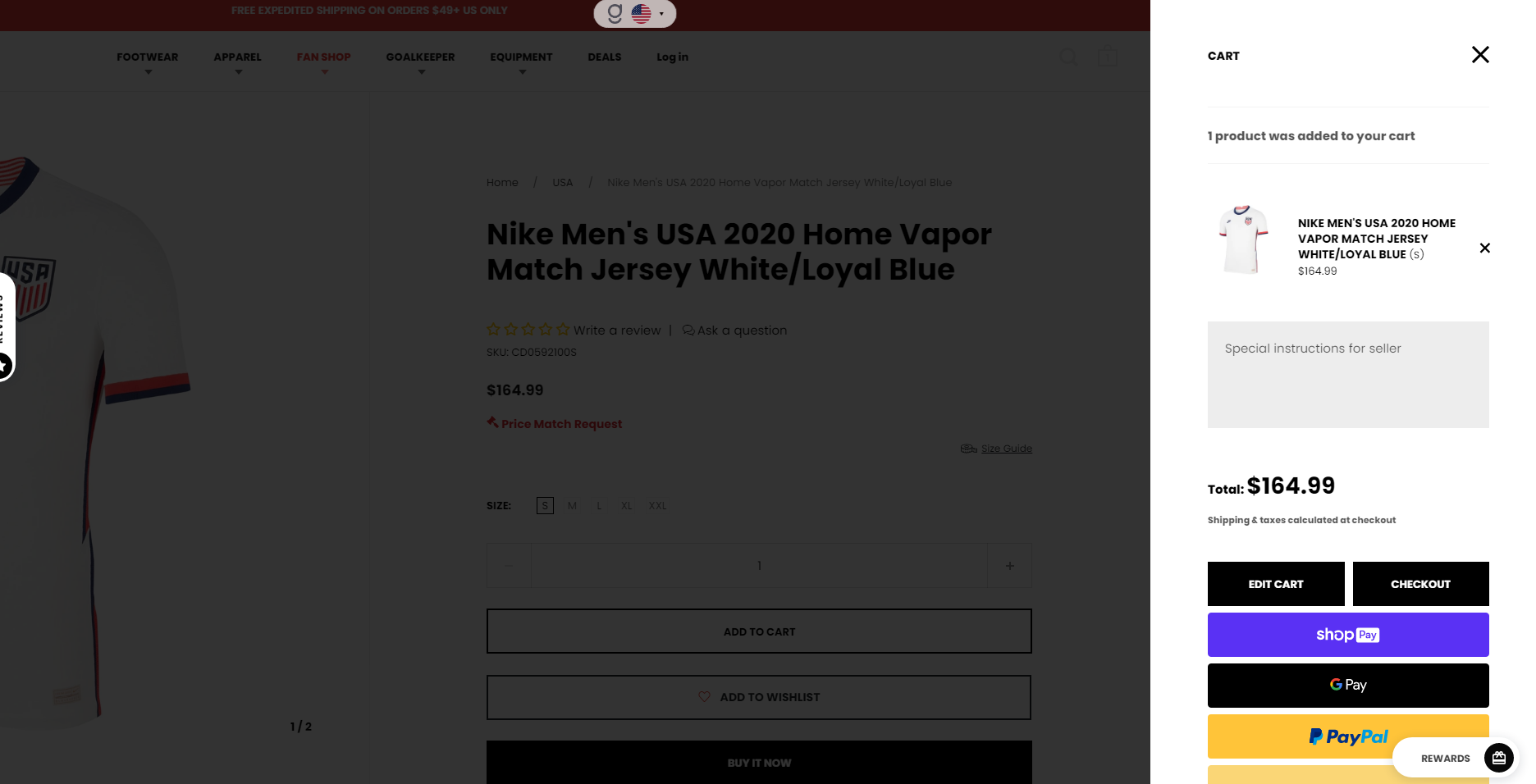
Every time an item is added to the cart, a confirmation must be shown to the buyer. It can be either a small popup on the right side, it can be a tiny toast or a simple animation. You can also show the cart on the right-hand side of the page as soon as they add their first product. This way they will be able to see the cart contents along with the total until the moment.

Image Courtesy: aztecasoccer.com
The Product Is In The Cart, Now What?
As we talk about the cart addition, what’s the suggested action now? Here are the two widely used approaches.
- Show ‘cart add’ confirmation and remain on the same page.
- Transfer the user onto the cart page.
Both of the above-mentioned approaches have their own pros & cons, as it depends on the strategy for your industry. The metrics to keep in mind are:
- Average transaction value
- Average quantity per transaction
Displaying Cart Contents Well
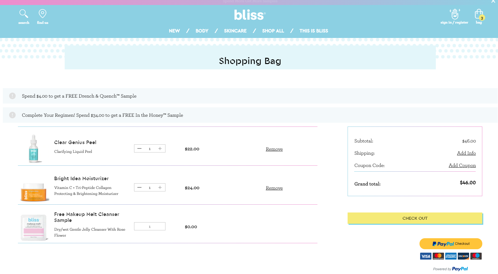
How should your cart look like? Follow this checklist:
- Product photos
- Product name & price
- Ability to remove, save for later, change details like size
- Show the kind of payments they accept
- Show total price with the option to change the shipping
- A clear call to action

Image Courtesy: blissworld.com
Get The Visual Hierarchy Right
What is the most desired action on a shopping cart page? The “Continue To Checkout”button. If you have a website where people tend to buy a few products per order, make sure you show them two CTAs, one above & below the cart.
Tip: This is a good time to address the FUDs (Fears, Uncertainties & Doubts), so include a few icons to indicate secure transactions. Also, show all the possible payment options as it has proven to have a positive effect on conversions.
Don’t Make Coupons Prominent
Have you ever visited the cart page, and realized you don’t have a coupon code? It hurts, right? You feel less special triggering the thought of buying something expensive than others.
Buyers might leave the website to search for coupons on Google and might result in card abandonment.
How to avoid this?
Offer a “Got a coupon?” link or something similar, and clicking on the link makes an input field. Text links are not visually very prominent, so fewer people will pay attention to them.
People who already have a coupon code will be looking for it – so unless you hid it really well, they will find it and will be able to apply their coupon code.
Remind Them About Shipping And Security
As we discussed in the last article about FAQs that all the questions must be addressed in the copy. Likewise, mention the mode of shipment, return policy, secure payment & related concerns on the page.
Persistent Cart
Persistent Cart not only improves the customer experience by combining guest and customer carts and allowing customers to start or finish check out from multiple devices, but it also increases conversion rates by reducing cart abandonment.
Save all the items in shopping the cart when a customer logs in. When they log out or access the cart from a different PC, re-add those (previous) items into their cart.
Ecommerce Checkout Pages
Follow these simple tips to ensure maximum conversions:
- Leave credit card info for last
- Design a payment form that looks like an actual credit card
- Make it look secure
- Store credit cards in your system
So, are you ready to implement some of the above best practices for the conversion rate optimization that we discussed?
P.S: If you found this post helpful, please share it on social media.