-
Pingback: Best Practices For Conversion Rate Optimization - Jibran Yousuf Khan

Best Practices For Conversion Rate Optimization – Part 4 of 6
This is the fourth article in the series of 6 articles focusing on the Best Practices for Conversion Rate Optimization.
Before we dive deeper into the Best practices for CRO, I would like to mention that the following content is based upon the learnings that I did during the Second Week of Conversion Optimization, my nano degree course at CXL Institute, led by Peep Laja & team.
I have divided this article into six parts to ensure maximum readability & thorough understanding.
In the last article, we discussed
- Principles of persuasive design
- Typography and content
- Radical redesign vs. evolutionary design
In this article, we will discuss,
- Home pages
- Pricing & pricing pages
- Website speed optimization
Let’s get started.
Home Pages
Whenever a home page is designed, there are two goals as the main objectives.
- Provide information to the user/visitor
- Provide useful links via top-level navigation for all the related additional information
As we dive deeper into the home page design, we come across the third goal or you can term it as the secondary goal. The secondary goal is to send visitors to the sales funnel. In order to achieve this, you have to work on the page fold, CTAs and visuals to lead the visitor in a particular direction.
To assess a home page, we look for answers to the following questions
- Does the page have a clear value proposition?
- Is there a single, clear primary call to action?
- Are there links to additional information?
Have a look at the home page of Slack and analyze it as per the above questions.
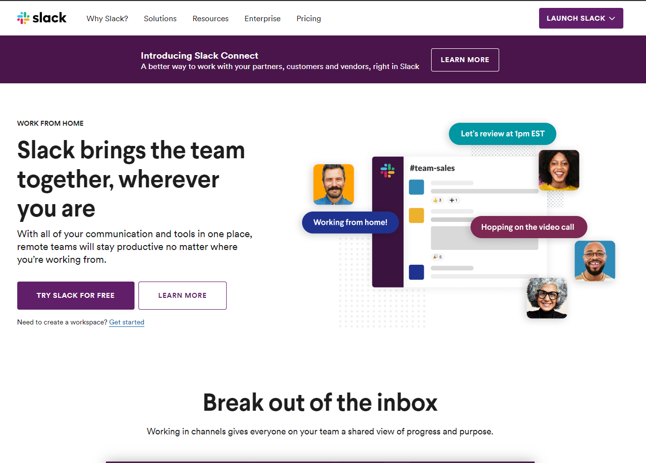
Courtesy: Slack.com
CXL conducted a study to evaluate the value proposition presentation and came around some interesting insights.
- The value proposition should be bigger intriguing the participants to notice it and focus on it.
- Bullet lists are preferred over a short paragraph.
- If you increase the benefits, it is easier for the visitor to recall a significant number of them.
However, it’s not recommended to blindly copy a home page, assuming it would yield similar results for your website as well. So keep experimenting by trying out different copies, visuals & layouts.
Pricing & Pricing Pages
The pricing page is the goal line to the business objective; It’s the point at which a buying decision is made.
We, as a business owner put so much time, sweat equity, and love into our products, but when the time comes to set up our pricing and build out our pricing page we spend only around a few hours arguing amongst our teams before deciding the number backed by a few discussions. As we talk about the best practices for conversion rate optimization, pricing page plays an important role in determining the growth of your business.
The Higher The Price Point, The More You Need To Explain
How much time would you spend on taking the decision if the product price is 1$? Minutes or even seconds. But if the product is being sold for 1000$, now? You would want to know more information or consult the product representative, take a look at reviews, or even read the FAQs. In other words, the more expensive your product or service is, the more content needs to be in front to back your pricing.
Don’t Ask People How Much They Would Pay
Instead of asking people to suggest the pricing, create a simple formula around it. Test the pricing with actual traffic and experiment with a few numbers until you come up with a rational price that performs well.
Things That Typically Work Well And You Should Experiment With
- Multiple prices vs. one price – list multiple packages with proper differences so they can decide which one is the best for them.
- Decoy pricing – a tricky scenario where one package is given an upper hand to ease the buyer’s decision
- Price Anchoring/Contrast principle – create multiple packages, having a huge difference, causing the customer to buy the cheaper pricing package/plan.
- Decoy + Contrast – use the above two points to create a pricing strategy for different packages.
- Price ending with 9s – do you think $9 price ending increases demands? Yes, and it’s backed by a number of case studies.
Should You Always Reveal The Prices (even in B2B)?
Definitely, if your competitors are disclosing the pricing on their website, whereas you are offering the visitor to request a quote, you will lose a lot of business. Most of the time, visitors are too impatient to request a quote.
However, if you don’t have fixed prices, you can always put a few slabs for the visitors so they would have an idea of estimated pricing. This practice will also ensure better qualified leads.
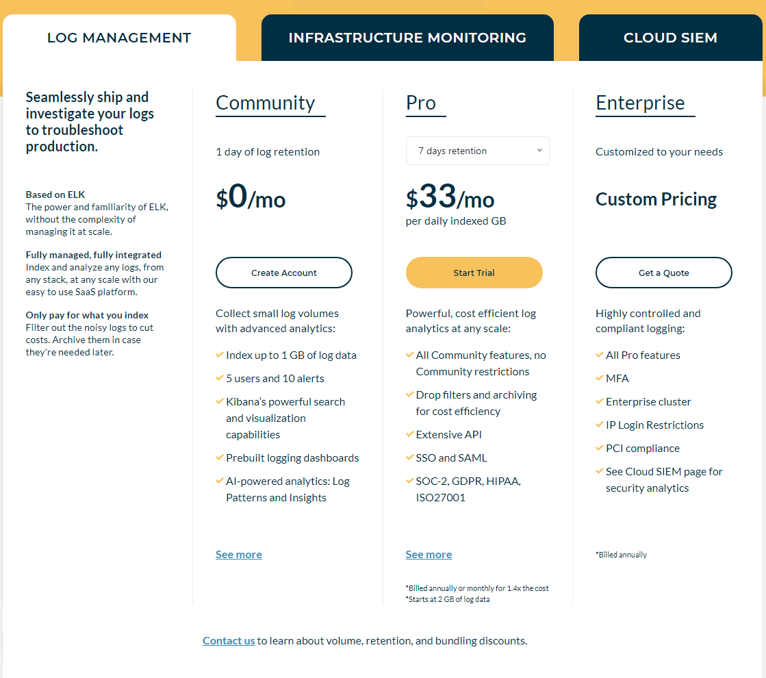
Image Courtesy: Logz.io
Some Best Practices/tips For Optimizers To Consider When Assessing Pricing Design
- Make it easy for the visitor to understand the differences between plans.
- Help the people identify the right plan for themselves.
- Address FUDs (fears, uncertainties, doubts).
- Offer multiple currency options to aid their buying decision
- Give a discount on annual plans
- Display a clear call to action
Website Speed Optimization
Website speed optimization affects the instantaneous gratification of the visitor. You wouldn’t want your website to take extra time to load as the visitor would instantly shift the focus on any other tab on the browser. A fast loading website can have positive effects on everything from user experience to bounce rate, time on site, and other important metrics.
Ideal Site Speed
Jakob Nielsen, who holds a Ph.D. in human-computer interaction, says 10 seconds can be the maximum loading time for a website.
Let’s take a look at some interesting stats:
- 47% of people expect a web page to load in two seconds or less.
- 57% of visitors will abandon a page that takes three seconds or more to load.
- more than 75% of your website visitors will shift to competitors if your site is not speed optimized.
- 8% of people cite slow loading pages as a key reason for abandoning their purchase.
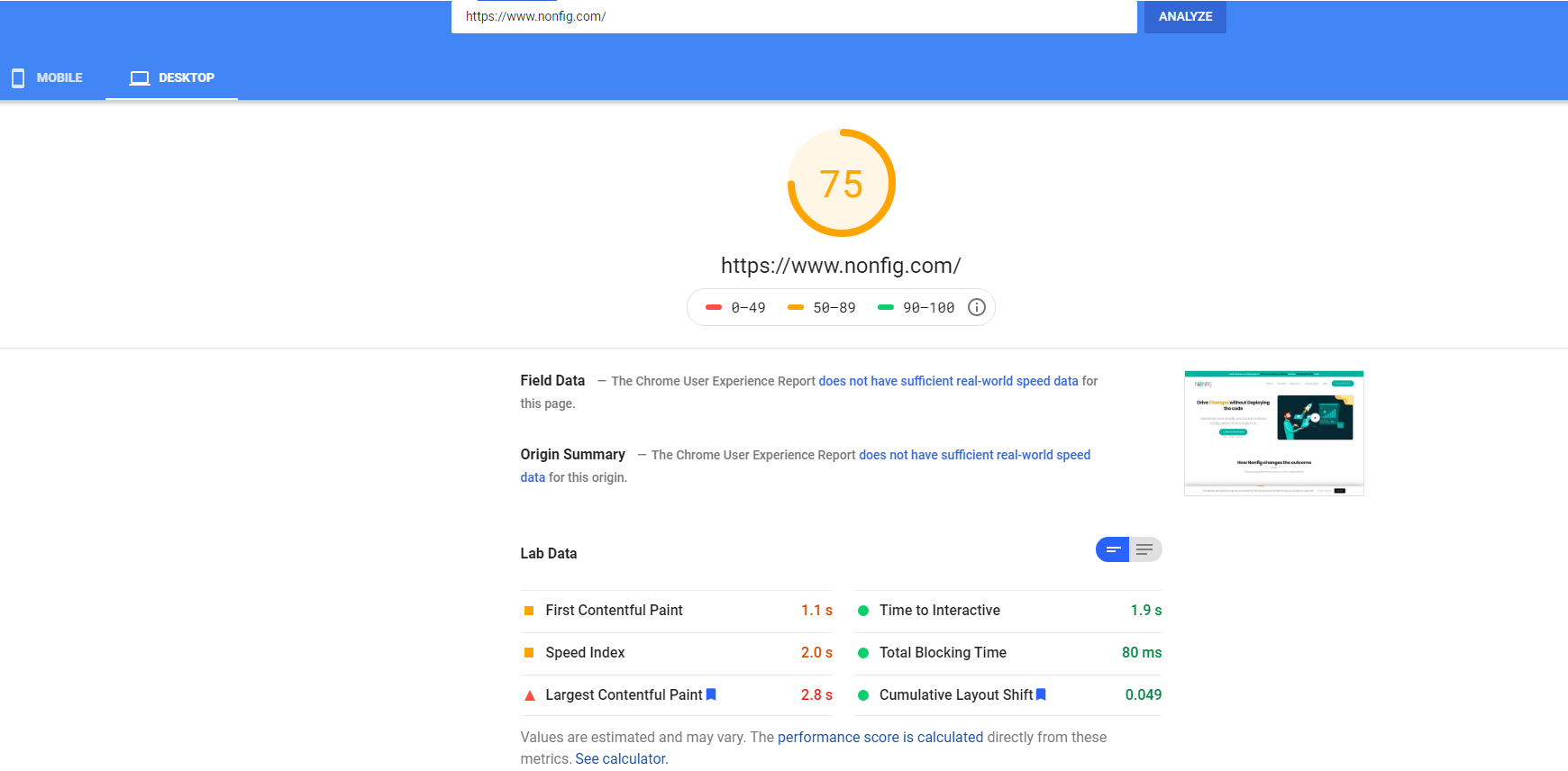
Image Courtesy: Google PageSpeed Insights & Nonfig
Tools To Evaluate Site Speed
All of these tools make it simple to test your site’s performance – usually, it’s as easy as pasting in your site’s URL and letting the tool work its magic.
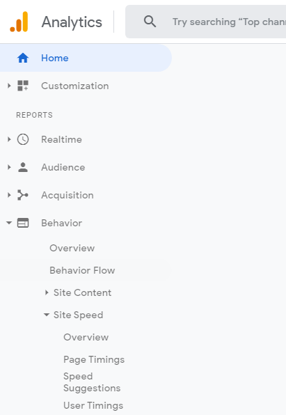
Tip: Check speed info in Google Analytics by visiting speed reports under the Behavior.
So, are you ready to implement some of the above best practices for the conversion rate optimization that we discussed?
P.S: If you found this post helpful, please share it on social media.