-
Pingback: Best Practices For Conversion Rate Optimization - Jibran Yousuf Khan
-
Pingback: Best Practices For Conversion Rate Optimization - Jibran Yousuf Khan

Best Practices For Conversion Rate Optimization – Part 3 of 6
This is the second article in the series of 6 articles focusing on the Best Practices for Conversion Rate Optimization. You can read the second part here.
Before we dive deeper into the Best practices for CRO, I would like to mention that the following content is based upon the learnings that I did during the Second Week of Conversion Optimization, my nano degree course at CXL Institute, led by Peep Laja & team.
I have divided this article into six parts to ensure maximum readability & thorough understanding.
In the last article, we discussed
- E-commerce Category Pages
- E-commerce Signups
- Incoming Phone Leads & Call Tracking.
In this article, we will discuss,
- Principles of persuasive design
- Typography and content
- Radical redesign vs. evolutionary design
Let’s get started.
Principles Of Persuasive Design
The literal definition of Persuasion is, “In business, persuasion is a process aimed at changing a person’s (or a group’s) attitude or behavior toward some event, idea, object, or another person (s), by using written, spoken words or visual tools to convey information, feelings, or reasoning, or a combination thereof.”
When we talk about Persuasive Design, it resonates with the effort that the marketer does to trigger a specific action by the visitor on your website.
Do you know what tactics Gary Vaynerchuk uses to persuade his audience? He talks fast, acts confident, guards them & swears a bit here and there too.
Let’s discuss the five principles of Persuasive Design
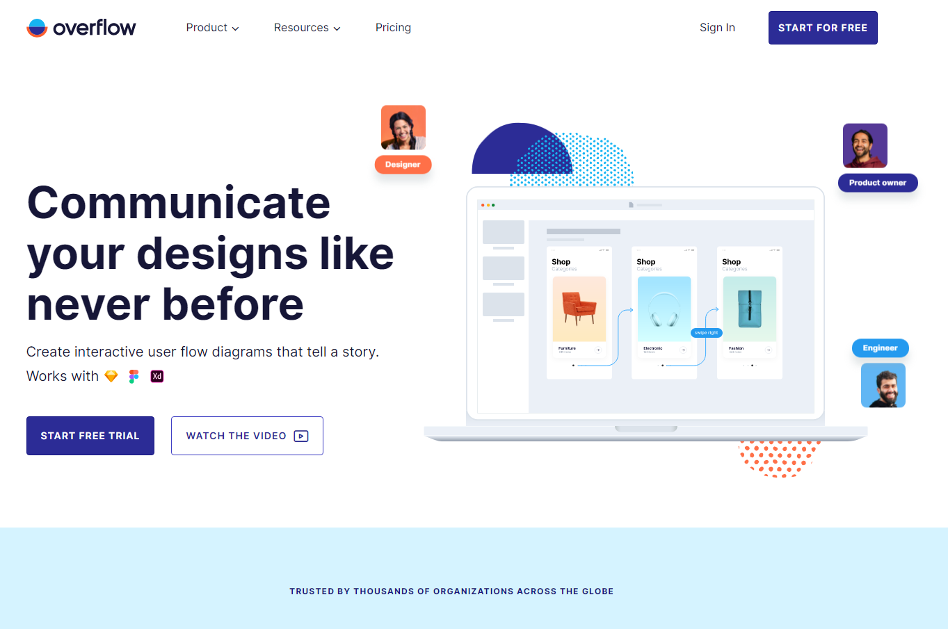
1. Clarity Above All
As soon as the visitor lands on your website, the human brain starts to process the copy & design. Some of the common questions are, what is it? What can I do here? How is it useful to me? If your copy & design are apparent in the first few seconds, your bounce rate will decrease, and the average time would be positively impacted. However, if you use long sentences, and words that sound more like riddles, the visitor will instantly lose the focus.

Courtesy: overflow.io
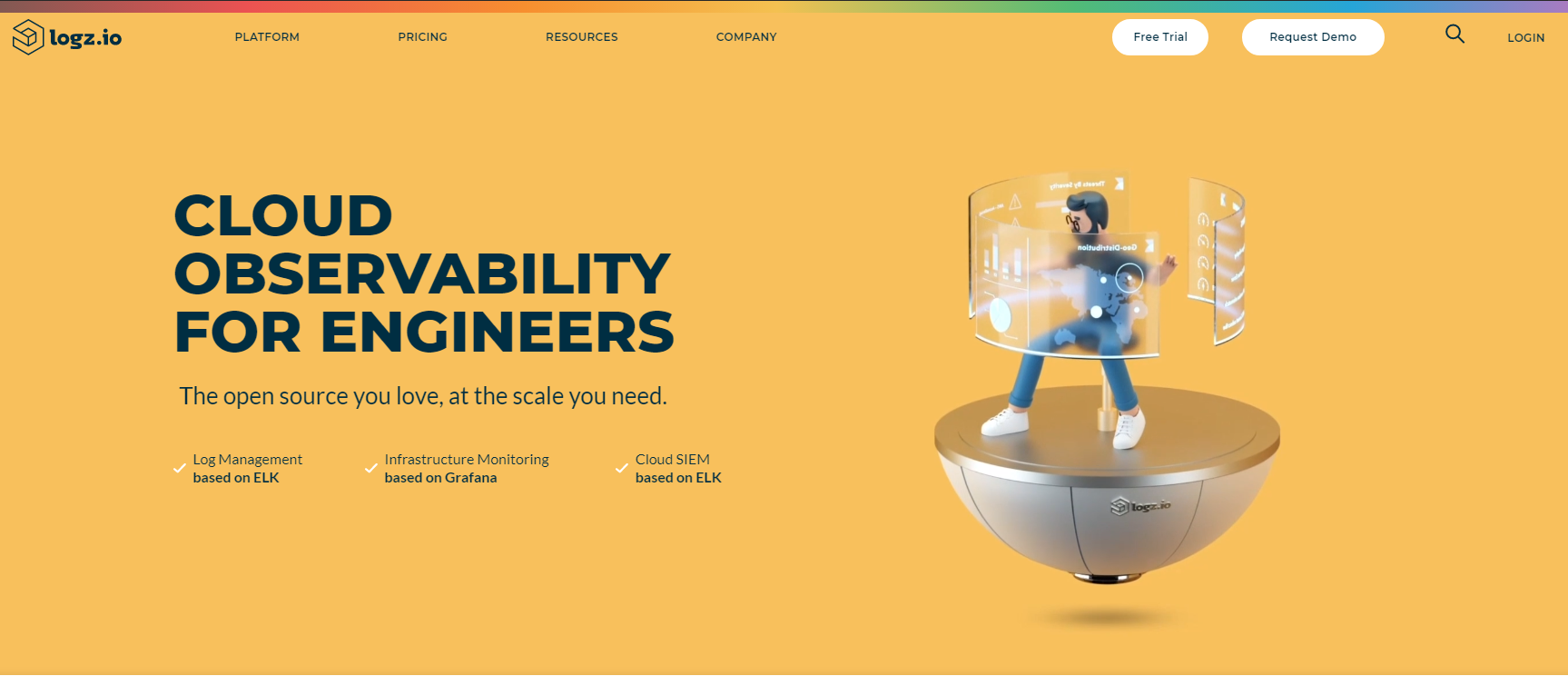
2. Visual Appeal
The human brain processes visuals 50 times faster than the copy. Whatever you do, make sure your website has compelling visuals. So, if you are selling physical products, show the best pictures. If you are selling services or SaaS tools, show the screenshots. Google recognizes two factors that determine visitors would like the website or not.
- Low visual complexity – the simplicity of design of the website
- High prototypicality – how familiar is the layout that you used

Courtesy: Logz.io.
3. Visual Hierarchy
When we talk about using visuals, we tend to focus on the design that prioritizes the objective of the website. As the first impression, the visitors notice the main design, the CTA, discount offers banner, or maybe the copy that you wrote as the highlighted headline. Now, if you want any of these to stand out, you have to give them appropriate size along with a color that makes it visible more than any other element as the first impression.
don’t forget that visual hierarchy is not about correctly stuffing everything. It’s also about the correct usage of white spaces to make the overall design look more straightforward, and the attention remains on the main element.
4. Conserve Attention At All Costs
Now that you have prioritized clarity maintained a visual hierarchy and used highly captivating visuals. It’s time for you to keep them hooked to your website. How would you sell your photography services? You can put high-quality images of your previous work and keep showing them until, at the end of the scroll, they find your fees or a form to contact you. Since you have already captured their attention, it would be easier to sell to them.
5. One Action Per Screen, When They’re Ready
How many pages does your website have? What are the most desired goals of these pages? Determine the actions. Every page on your website must have a single CTA, that should be most prominent, and visible. However, the CTAs, or triggers should be placed carefully, after analyzing the peak of motivation for that particular action. Poorly placed CTAs would harm your conversion rate.
The goal of persuasive design is to make sure the fold area is distinct, creating a value proposition statement, and giving people enough reason to scroll down.
Typography And Content
Typography focuses on adjusting the text within the design while creating compelling content. It provides an attractive appearance and preserves the aesthetic value of your content. When we talk about best practices for conversion rate optimization, typography plays a vital role in setting the overall tone of your website and ensures a great user experience.
Let’s understand this with the help of a few questions.

What’s the best font size and type?
The recommended smallest size is 16 pixels for body copy. However, smaller font sizes can be used for mentioning help texts such as instructions for form labels, etc. Apart from font size, line height needs to be carefully assessed too. Headlines & CTAs would be more significant & prominent.
Is there a best font?
No, however, some standard fonts are used mostly as they are easy to read, such as Arial, Georgia, or Tahoma. If you are using a new font that forces the visitor to apply extra focus on understanding the text, you will affect the readability negatively.
How to structure the copy?
The recommended approach is
- using ordered and unordered lists,
- serving images with text to break it up,
- new paragraph every 3-4 lines,
- sub-headline every 1-2 paragraphs.
Is there an optimal line length?
As most studies confirm, the ideal length is around 50-75 characters.
If the length exceeds, the reader will have a hard time focusing on the text.
If you have lesser characters, the visitor’s reading rhythm would be disturbed now and then.
What gets read?
To answer this, I am mentioning the most favorable structure of copy that is easy for the eyes to scan.
- Headline (#1)
- Intro paragraph,
- Bullets above the fold,
- Sub-headlines.

The amount of text that read by a great deal is reduced due to poor content. Don’t try to save money by hiring a cheap copywriter, as it will drastically affect the conversion rate.
Radical Redesign vs. Evolutionary Design
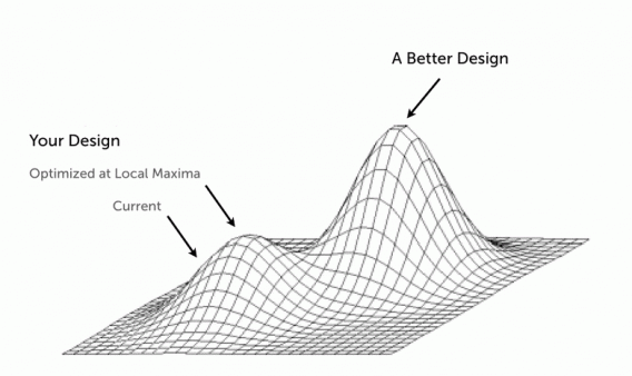
Local Maxima
The point where despite your continuous changes to the design, the effects are close to negligible or non-existent, is called the Local Maxima. This is also the point where the conversion analysts have to make a decision. Either they go with more updates to the current design (evolutionary design approach) or choose to redesign of the page. This decision heavily relies on the data along with their intuition.

Courtesy: Andrew Null
How To Decide When To Redesign?
The first simple answer to this much-debated question is to assess if it’s brand & identity redesign? If yes, the optimal solution is to start over. Otherwise, go through the conversion research, identify the issues, and make sure you note down everything that is working. As it’s preferable that the new design includes all the positive aspects of the previous design.
When is Radical Design Better?
- You’ve hit the Local Maxima.
- Outdated tech-stack and legacy technologies are used.
- The design layout is not the standard practice anymore.
- Conversion analysis has revealed a considerable number of design issues.
When is the Evolutionary Approach Better?
- You have space and ideas to test with a high probability of significant effects on conversion rate.
- A large number of returning visitors have adopted your current design.

So, are you ready to implement some of the above best practices for the conversion rate optimization that we discussed?
P.S: If you found this post helpful, please share it on social media.