Crafting Effective Unique Value Propositions by Jibran Yousuf

Crafting Effective Unique Value Proposition

  • What is the Value Proposition?
  • Why is it important?
  • Are they only critical to sales narrative online or they are important offline too?

In this article, we will sharpen our understanding of what a Unique Value Proposition actually is.

Before we dive deeper into the product messaging, I would like to mention that the following content is based upon the learning that I got during the ninth Week of Conversion Optimization, my mini degree course at CXL Institute, led by Peep Laja & the team.

Understanding Value Proposition

In every marketing textbook, you will find a discussion on understanding the value proposition yet people have a limited understanding of what it actually is and why it matters. In the last article, we discussed the Conversion Heuristic Formula.

C = 4M + 3V + 2(I-F) – 2A

Analyzing this formula, notice that the biggest, most influential element is Motivation.

  • What is going on in your prospect’s minds when they hit the page?
  • Their expectations?
  • What are they looking for?

There are so many questions, yet we cannot control them. We might be able to influence the visitors’ motivation to visit the page, but the entire control is not possible. Then what can we control? The next biggest element, Value Proposition.

Let’s look at the most widely used meanings of Value Proposition.

  1. What’s In It For Me? (WIIFM)
  2. Why should I choose you over X?
  3. What is your differentiator?
  4. What’s your unique advantage?
  5. What’s the reason to buy from you?

Creating A Value Proposition

Now that we understand what is a value proposition, let’s dive into how to create effective value propositions. Before moving forward, we will be using the first 2 meanings/questions of value propositions.  Listing them down in a sequential manner:

  1. Gather your team & stakeholders.
  2. Ask them, What’s In It For Me?
  3. Once someone answers that, ask that person, Why should I choose you over X?
  4. Don’t stop here, as soon as you get the answer, just ask So What?
  5. Don’t stop yet, ask again, Okay, prove it.

The objective is to stress test your value proposition so so what & prove it over and over again, that you actually get virtually anyone excited, about the promise that you are giving them.

How To Brainstorm the BEST Unique Value Proposition

Keeping in mind that brainstorming the best value proposition is really about the most promising value proposition but then you really should try to validate it with external research as early as you can. These are the steps that are recommended to take.

List Your Product’s Key Features

  1. Pinpoint Those That Are Unique
  2. List Customer Pain Points for Each Feature
  3. Define Desirable Outcomes for Each Pain
  4. Score Pains/Outcomes by Severity & Frequency
  5. Edit Top>Scored Pain/Outcomes Into MVPs
  6. Score the UVPs (and go with the best one!)


How To Conduct A Copy “Teardown” by Jibran Yousuf

How To Conduct A Copy “Teardown”

In this digital era, a website is mandatory for every business that is launched.  However, the effectiveness of these websites depends on several factors. In this article, we will focus on the basis of a copy teardown, which is an essential step in enhancing product messaging.

Before we dive deeper into the product messaging, I would like to mention that the following content is based upon the learnings that I did during the eighth Week of Conversion Optimization, my mini degree course at CXL Institute, led by Peep Laja & team.

If you are a startup, your website should be optimized for

1. Building relationships with your customers
2. Ultimately selling your product

Every visit counts—especially if it’s a qualified visit.

Basis Of Copy Teardown

When we talk about conventional teardowns, the biggest problem is that page tear downs or their heuristic analogies, they can be hugely opinion-based, and when that happens people contend to just revel in channeling their inner Simon Cowell and just ripping a page to shreds based on just what they like or they don’t like.

To avoid this, we will be focusing on three elements for the systematic copy teardown approaches backed by proven formulas.

Basis of copy teardown.

Image Courtesy: CXL Institute

MECLab’s Conversion Heuristic Formula – Teardown Element #1

In order to address the persuasive argument on the page affecting the conversion rate, MarketingExperiments’ came up with a formula (not an actual mathematical equation). This equation focuses on the probability of conversion, or in other words the probability that your visitor is going to make a purchase.

Basis of copy teardown. - MarketingExperiments' Conversion Heuristic Formula

Image Courtesy: CXL Institute

Let’s discuss the elements in this formula.

  • C = Probability of Conversion – What is the probability of the prospects saying yes to your offer?
  • M = Motivation – Understand the prospect’s motivation and make sure that your messaging is aligned with that motivation.
  • V = Clarity of Value Proposition – What are you offering your prospects that they can’t get anywhere else?
  • I = Incentive – Special offers to incentivize customers to purchase their products.
  • F = Friction – Decreasing the friction, such as a low number of clicks to buy, easy checkout process, etc.
  • A = Anxiety – Take care of FUDs (Fears, Uncertainties & Doubts)

Cialdini’s Principals Of Persuasion – Teardown Element #2

One of the most cited books on Influence & Persuasion is Robert Cialdini’s Influence: The Psychology of Persuasion. First published in 1984, Influence remains an essential item for every marketer’s reading list.

In Influence, Cialdini boils down the key ingredients into the following “weapons of influence”:

Basis of copy teardown. -Cialdini’s 6 Principles of Influence/persuasion

Image Courtesy: CXL Institute

There are six original principles, whereas the seventh principle has been added pertaining to periodic updates to product messaging.

A large part of the successful high-converting landing page lies in understanding and channeling that perfect mix of persuasive ingredients that convinces visitors to act.

Let’s discuss the elements:

  • Social Proof – Target the tribal human nature, every time we are uncertain, we take cues from people around us.
  • Authority – In order to be trusted, you need to position your brand as an authority
  • Liking – People end up buying a particular product simply because we like the person selling it to us.
  • Scarcity/Urgency -People desire the things they perceive as less available. That’s the principle of scarcity.
  • Reciprocity – People are conditioned to follow the rule of “give and take”.
  • Commitment/Consistency – Align the external behaviors with inner beliefs and values. Focus on the rule of commitment and consistency.

Claude Hopkins’ Scientific Advertising – Teardown Element #3

Widely regarded as the first conversion copywriter, Claude Hopkins used to put promo codes in his ads that people had to use to get the offer. Based on these unique promo codes, he was able to track the conversions, effectively analyzing the results to continually improve his ad results.

“We cannot go after thousands of men until we learn how to win one.” – Claude C. Hopkins

Hopkins’s Rule #1: Be Specific

A generic copy that summarizes a lot of things is more likely to be completely forgotten by people, as it lacks really fine, specific memorable details. If you want your copy to stand out, focus on the specificity. 

“Platitudes and generalities roll off the human understanding like water from a duck. They leave no impression whatsoever… People recognize a certain license in selling talk as they do in poetry. A man may say, “Supreme in Quality” without seeming a liar, though one may know that other brands are equally as good … But just for that reason, general statements count for little. And a man inclined to superlatives must expect that his every statement will be taken with some caution. …But a man who makes a specific$claim is either telling the truth or a LIE. People don’t expect the advertiser to LIE.”

Hopkins’s Rule #2: Offer Service

“Remember that the people you address are selfish, as we all are. They care nothing about your interest or your profit. They seek service for themselves. Ignoring this fact is a common mistake and a costly mistake in advertising. …The best ads ask no one to buy … [They] are based entirely on service. They offer wanted information. They cite advantages to users. Perhaps they offer a sample … so the customer may prove the claims without any risk. Some of these ads seem altruistic.
But they are based on a knowledge of human nature.”

Hopkins’s Rule #3: Tell The Full Story

“There is no fixed rule on the subject of brevity. One sentence may tell a complete story on a line like chewing gum. It may on an article like Cream of Wheat. But, whether long or short, an advertising story should be reasonably complete.”

Hopkins’s Rule #4: Be A Sales(wo)man

“There is one simple and right way to answer many advertising questions. Ask yourself: “Would this help a salesman sell the goods? Would it help me sell them if I met the buyer in person?” …Some argue for slogans, some like clever conceits. Would you use them in personal salesmanship? Can you imagine a customer whom such things would impress? If not, don’t rely on them for selling in print.” … When one tries to show off or does things merely to please himself, he is little likely to strike a chord which leads people to spend money.”

So, are you ready to teardown your website copy using the above-mentioned formulas?

P.S: If you found this post helpful, please share it on social media.

RECEIVE WEEKLY LESSONS

    Best Practices For Conversion Rate Optimization – Part 6 of 6

    This is the sixth & last article in the series of 6 articles focusing on the Best Practices for Conversion Rate Optimization.

    Before we dive deeper into the Best practices for CRO, I would like to mention that the following content is based upon the learnings that I did during the seventh week of Conversion Optimization, my nano degree course at CXL Institute, led by Peep Laja & team.

    I have divided this article into six parts to ensure maximum readability & thorough understanding.

    In the last article, we discussed

    • Visual Hierarchy
    • FAQs on Website
    • Importance of Visual Design

    In this article, we will discuss,

    • Internal Search
    • Shopping cart pages
    • Ecommerce checkout pages

    Let’s get started.

    Internal Search

    It’s a well-known fact that people who perform searches on an e-commerce website, tend to convert better. If you are having more 20 products or pages, it would be highly beneficial to add the search functionality.

    Most of the time, people browse first as they don’t know what exactly they want. So they search with keywords, ending up on the particular product page if they find it. Let’s go through some of the best practices for the conversion rate optimization focusing on the internal searches.

    Make The Search Box Bigger

    Have you noticed how Amazon encourages search? They have added a search bar right at the top, with a dropdown menu for category selection just in case the visitor wants to refine its search.

    Apart from size, the location of the search bar also matters. Most of the time visitors have to look around for the search bar, which highly affects the conversion rate.

    Best Practices for Conversion Rate Optimization by Jibran Yousuf

    Image Courtesy: Amazon.com

    Product Images In The Site Search Window Boost Conversions

    The search bar has evolved a lot in the past few years. Some stores show results on their search results pages, however, a widely adopted best practices is to show search results right under the search bar when the query is being typed.

    Take a look at this t-shirt store, I searched for “Dragon” and instantly got results below the search bar, handy, isn’t it?

    Best Practices for Conversion Rate Optimization by Jibran Yousuf

    Image Courtesy: The Mountain

    Optimize The Search Function

    How can you make your search functionality better? Take care of these 3 basic add-ons.

    1. Enable autocomplete – visitors should get suggestions as they type.
    2. Show results even if the search query had typos.
    3. Avoid “No Results found” – show relevant results if there are no exact results.

    Shopping Cart Pages

    Shopping cart is one of the most critical pages for your website. As soon as a buyer adds their first item in the cart, they have progressed to shopping from browsing. Our job is to make sure they progress towards payment.

    What Should A Cart Addition Look Like?

    Every time an item is added to the cart, a confirmation must be shown to the buyer. It can be either a small popup on the right side, it can be a tiny toast or a simple animation. You can also show the cart on the right-hand side of the page as soon as they add their first product. This way they will be able to see the cart contents along with the total until the moment.

    Best Practices for Conversion Rate Optimization by Jibran Yousuf

    Image Courtesy: aztecasoccer.com

    The Product Is In The Cart, Now What?

    As we talk about the cart addition, what’s the suggested action now? Here are the two widely used approaches.

    1. Show ‘cart add’ confirmation and remain on the same page.
    2. Transfer the user onto the cart page.

    Both of the above-mentioned approaches have their own pros & cons, as it depends on the strategy for your industry. The metrics to keep in mind are:

    • Average transaction value
    • Average quantity per transaction

    Displaying Cart Contents Well

    How should your cart look like? Follow this checklist:

    • Product photos
    • Product name & price
    • Ability to remove, save for later, change details like size
    • Show the kind of payments they accept
    • Show total price with the option to change the shipping
    • A clear call to action
    Best Practices for Conversion Rate Optimization by Jibran Yousuf

    Image Courtesy: blissworld.com

    Get The Visual Hierarchy Right

    What is the most desired action on a shopping cart page? The “Continue To Checkout”button. If you have a website where people tend to buy a few products per order, make sure you show them two CTAs, one above & below the cart.

    Tip: This is a good time to address the FUDs (Fears, Uncertainties & Doubts), so include a few icons to indicate secure transactions. Also, show all the possible payment options as it has proven to have a positive effect on conversions.

    Don’t Make Coupons Prominent

    Have you ever visited the cart page, and realized you don’t have a coupon code? It hurts, right? You feel less special triggering the thought of buying something expensive than others.

    Buyers might leave the website to search for coupons on Google and might result in card abandonment.

    How to avoid this?

    Offer a “Got a coupon?” link or something similar, and clicking on the link makes an input field. Text links are not visually very prominent, so fewer people will pay attention to them.

    People who already have a coupon code will be looking for it – so unless you hid it really well, they will find it and will be able to apply their coupon code.

    Remind Them About Shipping And Security

    As we discussed in the last article about FAQs that all the questions must be addressed in the copy. Likewise, mention the mode of shipment, return policy, secure payment & related concerns on the page.

    Persistent Cart

    Persistent Cart not only improves the customer experience by combining guest and customer carts and allowing customers to start or finish check out from multiple devices, but it also increases conversion rates by reducing cart abandonment.

    Save all the items in shopping the cart when a customer logs in. When they log out or access the cart from a different PC, re-add those (previous) items into their cart.

    Ecommerce Checkout Pages

    Follow these simple tips to ensure maximum conversions:

    1. Leave credit card info for last
    2. Design a payment form that looks like an actual credit card
    3. Make it look secure
    4. Store credit cards in your system

    So, are you ready to implement some of the above best practices for the conversion rate optimization that we discussed?

    P.S: If you found this post helpful, please share it on social media.

    RECEIVE WEEKLY LESSONS

      Best Practices For Conversion Rate Optimization – Part 5 of 6

      This is the fifth article in the series of 6 articles focusing on the Best Practices for Conversion Rate Optimization.

      Before we dive deeper into the Best practices for CRO, I would like to mention that the following content is based upon the learnings that I did during the Second Week of Conversion Optimization, my nano degree course at CXL Institute, led by Peep Laja & team.

      I have divided this article into six parts to ensure maximum readability & thorough understanding.

      In the last article, we discussed

      • Home pages
      • Pricing & pricing pages
      • Website speed optimization

      In this article, we will discuss,

      • Visual Hierarchy
      • FAQs on Website
      • Importance of Visual Design

      Let’s get started.

      Visual Hierarchy

      A hierarchy is an organizational structure in which items are ranked according to levels of importance.

      When we talk about visual hierarchy, we focus on the order in which the human eye perceives the design.

      In web design, there are some sections or parts that are more important than others. These can be forms, having certain CTAs, value propositions. Since these are important, you would want them to get more attention and time.

      Remember, that visual hierarchy is not only about size, but also about color, & position of an element on the website.

      If you are having 5 identical buttons on your website, the user won’t be able to differentiate and you will always get random clicks. However, if you make a button prominent by changing its color, size, or position, you will be driving more clicks on that particular button.

      Start With The Business Objective

      The easiest way to prioritize elements is to rank them on the basis of your business objective.

      In order to understand this phenomenon and practice it, start visiting the website and rank them the elements in the visual hierarchy. Compare them with your own website. Do changes as per your analysis.

      Rank Your Most Wanted Actions For Every Page

      Once you are done with the landing page, head over to other pages. Identify the most wanted action on each of these pages. Make it stand out on the whole page.

      Example: ActiveCampaign wants the visitor to choose the Professional Plan, there can be several reasons for that. So they made it prominent by putting a badge of Most Popular and highlighting the plan with dark blue color.

      Best Practices for Conversion Rate Optimization by Jibran Yousuf

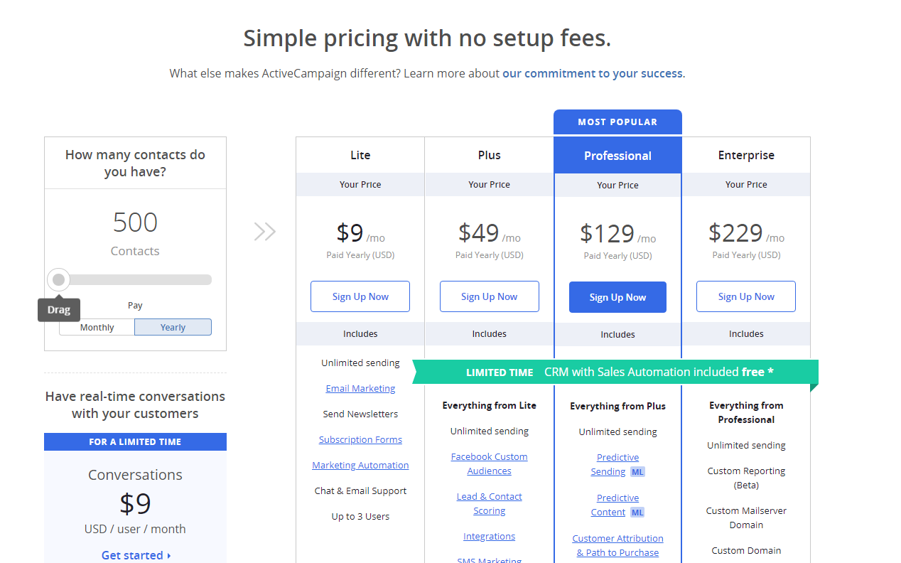
      Image Courtesy: ActiveCampaign

      FAQs On Websites

      Frequently Asked Questions (FAQs) is a list of answers to common questions about a product or service.

      The purpose of FAQs is to provide information on frequent questions or concerns.

      The question is, should a website has an FAQ section or not?

      For a marketer, the priority should be to eliminate the need for FAQs. If your audience has to read instructions to figure your product or service, you are not communicating the message correctly.

      There are many websites that put their whole pitches in FAQs disguised as questions, which is an absolute waste of space.

      If you are needing an FAQ section to explain your pricing, you must review your pricing page and the whole copy. Try to put the answers to FAQs in the copy.

      How to figure what to put in the copy? Just pay attention to the questions that are being asked via support emails, live chat & queries. Then put the answers to these questions into your website copy.

      Importance Of Visual Design

      What is your definition of the best design?

      The best design is the one that was driven by data and brings in the most money. Creativity is important, and an essential part of web designing but the decision should be taken on the basis of data.

      Why design is important? Humans process visuals 50 times faster than copy, and we are quick to judge. Period.

      Design affects the trust scale too. If you a poorly design website, visitors would instantly doubt your authenticity within milliseconds.

      Let’s talk about a few critical, & objective aspects of design.

      People Judge Websites In Less Than 50 Milliseconds

      Humans make snap judgments when they meet a new person; websites are judged similarly!

      As per the research conducted by Gitte Lindgaard, Gary Fernandes, Cathy Dudek & J. Brown. It was concluded that it takes about 50 milliseconds for visitors to form an opinion about your website.

      As per the research conducted by Google, visitors develop opinions even within 17 ms (though the effect was less pronounced on some design factors).

      The first impression depends on multiple factors, some of them are:

      • Structure
      • Color
      • Spacing
      • Symmetry
      • Amount of Text
      • Fonts

      First Impressions Are 94% Design-related

      As stated earlier, the design drives trust.

      There have been multiple studies, that concluded that design elements have the biggest influences on first impressions, including logo, main images, colors & the navigation menu.

      Human minds process visuals 50 times faster than the copy.

      Inspiration Drives Better First Impressions

      Impression-related impressions have a greater impact on the first-impression formation, followed by usability. Visual appealing stimuli are an important tool for getting visitors to stay on your website.

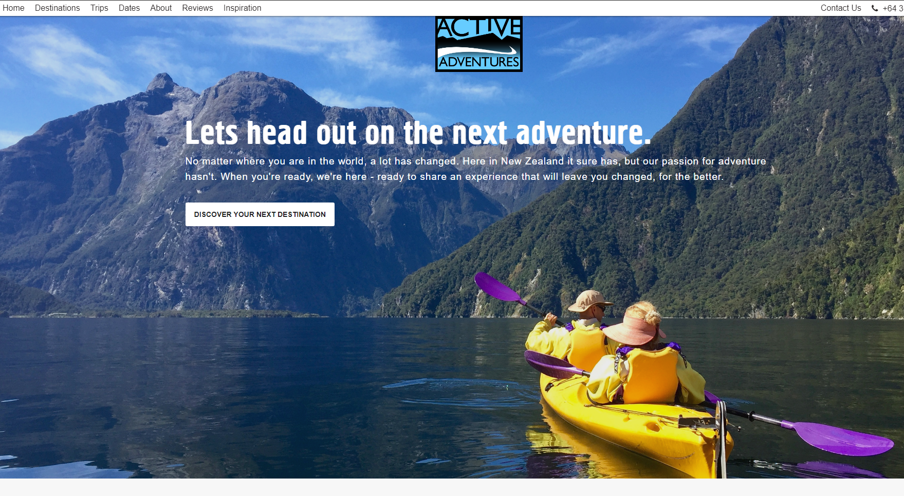
      If you are a tour operating website, using larger than life photography would really increase the gains.

      Have a look at the Active Adventures website, as they know how to capture people when they feel most inspired.

      Best Practices for Conversion Rate Optimization by Jibran Yousuf

      Two Key Ingredients Of Web Design People Like: Simplicity And Prototypicality

      Simplicity: As per a study by Google, in 2012, researchers found that simpler & familiar design is better, as compared to visually complex websites.

      The simpler design promotes less noise, which means fewer distractions. Simplicity is about focus & clarity of the purpose that should make the visitors instantly understand what’s going on, leading to the singular goal of the page.

      Prototypicality: The human mind creates a template of everything that it interacts with. When we put the same phenomenon on websites, the human mind creates a blueprint of how a SaaS website, blog, or e-commerce site should look like.

      If you change the design too much in the pursuit of innovation, it might backfire.

      Stop Arguing Over Opinions. Data-driven Design Is The Way: Measurable Approach To Better Design

      If it can be measured, it can be improved.

      There are several tools that let you assess your design, measure the clicks, and analyze the funnel. How long they stay, and what errors & issues make them leave the website.

      The whole point of data-driven design is to use the data to identify what’s working and what’s not, and to improve productivity.

      So, are you ready to implement some of the above best practices for the conversion rate optimization that we discussed?

      P.S: If you found this post helpful, please share it on social media.

      RECEIVE WEEKLY LESSONS